Font selection with trendy fonts of 2024
Accessibility is the key to success
Typography should be accessible, because the task of any text is to effectively convey the message to the audience. However, this does not mean that we should sacrifice creativity or expressiveness.
We have to find a balance between functionality, aesthetics, and accessibility. This means that sometimes simpler fonts are better than decorative and intricate ones. For example, grotesques make text more readable and airy.

Accessibility is not limited to setting the kerning correctly or choosing contrasting colors. These are legible symbols, clear visual hierarchy, unobtrusive textures, etc. In the new year, inclusive fonts and styles will become a key element of of visual identity. More and more brands are committing to making their typography accessible to the entire audience. A great example is the new logos of Intel, Johnson & Johnson, and Infiniti.
- ALT Riviera – Grotesk Typeface
- Postmark Font
- TT Firs Text
- SK Nomerok
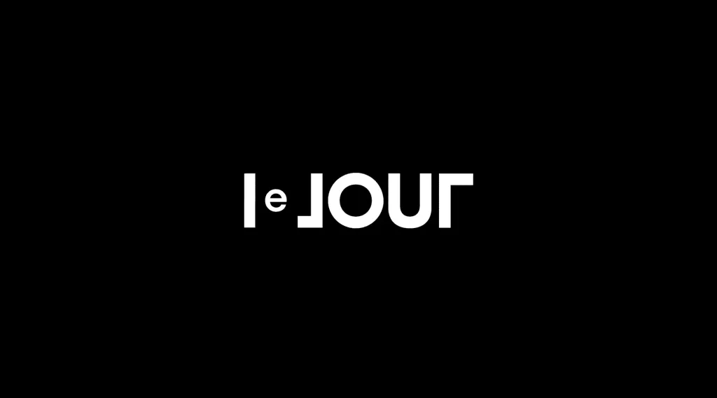
- Três Ficções – Jorge Luis Borges
Geometric sans serif fonts
It may seem that sans serif fonts have nothing else to offer us. Straight lines, rounded corners, minimalist aesthetics - we have seen it all thousands of times. However, this type of typography has a lot of loyal fans for a reason. First of all, it loved by minimalist fans for its simplicity, today it is becoming a platform for experimentation and creativity.
We are increasingly seeing fonts that seem simple at first glance. Pay attention to the details! Sometimes these are completely unexpected solutions: symbols of uneven width, multidirectional letter slant, graceful Art Deco-inspired shapes, etc.
Any sans-serif font with custom details will instantly revitalize your projects, make them more dynamic, and at the same time organically fit into the composition. This is true for logos, corporate identity, websites, and printed materials. That’s because original grotesques provide high readability and are harmoniously combined with other graphic elements. They help to find a balance between classic and modern aesthetics. Forget about serifs (for now) and go to the dark side!

- FAT EVIL FONT
- Erbaum Type Family
- 13e art – Brand identity
- DESEO DISPLAY Typeface
Balanced artistic typography
Experimental typography remains on the list of trends. Back in 2019-2020, designers tried to outdo each other in ingenuity, and the abundance of new fonts made us dizzy! This font trend continues to to develop - let’s see in which direction.
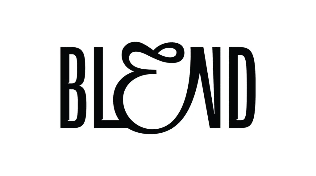
Balanced artistic typography is a logical continuation of the previously mentioned trend towards accessibility. If experimental styles inspired designers to abandon the human-centered approach in favor of self-expression, we are now seeing the opposite process. The user and his or her needs come first, and only then the individuality and expressiveness of the brand. After all, what’s the point of typography if it doesn’t serve people?

We are returning to a more harmonious design philosophy. The perfect combination of brand style, audience needs, technical skill, organic typography, and design flair - all these elements should complement each other without picture.
- Blend (Fruity Hard Seltzer)
- June Expt
- Quelia Typeface
Cartoon letters
The best respite from the harsh reality is bright, playful fonts imbued with cartoon aesthetics! They are distinguished by their character and seem ready to jump out at us from the screen. Cartoon letters don’t just form words, they tell stories and convey emotions, making any message more alive.
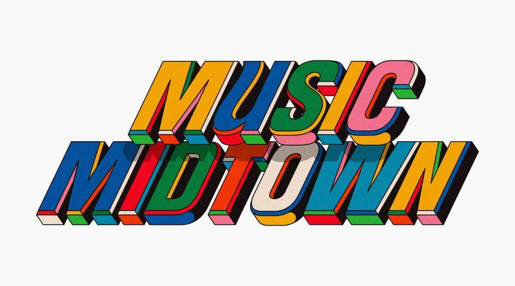
These fonts occupy an intermediate position between retro and modern. Some of them evoke nostalgia and are associated with classic comic books. Others are a modern interpretation of the cartoon theme and push the boundaries of traditional typography. This duality makes cartoon letters incredibly versatile - they are equally appropriate for movie posters and interfaces, and attract a diverse audience.
Cartoon typography is a celebration of creativity and fun. It reminds us that fonts can be both a reference to the past and a leap into the future. to the past and a leap into the future. So, whether you want to add a touch of nostalgia or make your design super modern, these playful fonts are ready to turn your projects into something truly memorable.
- Music Midtown – Festival Branding
- Type Scraps – Sept + Oct ’23
- Korge — Bold Slab Font
- Type illustration 2023
New serif fonts: thin and even thinner
Sans serif fonts are in their golden age. In 2024, they will push the boundaries of sophistication with almost with virtually weightless strokes.
Where did this trend come from? In a world that is constantly bustling with bright graphics and loud messages, delicacy, restraint, and delicacy, restraint, and calm confidence. Discover the new era of serif fonts with their subtle lines and elegant curves.

But don’t be fooled by their slender appearance - these fonts are amazingly versatile. From high-end branding to sophisticated print publications, serifs can take any project to the next level. Imagine the logo of a luxury brand, made in a fine font that doesn’t shout, but is full of meaning, or a magazine spread that captivates with its understated elegance.
What’s more, these ultra-thin serif fonts are also suitable for digital interfaces, where clarity and readability are are paramount. They can give a website or app a modern, aesthetic look while maintaining the accessibility of textual content.

So if you want to make your design more sophisticated, this trend is exactly what you need. After all, sometimes the quietest voice in the room attracts the most attention.
Font combinations
2024 will be the year of font combinations. It’s like creating the perfect cocktail, only with fonts - a little bit of massive here, a little bit of sophistication there, and voila! Unexpected combinations - for example, a modern geometric font + calligraphic font, or italics + bold image - will help us create a design that will resonate with the audience.
Imagine a powerful champion typeface paired with an elegant, lightweight font. No one will be able to help but stare! Mix images, styles, and even completely different typefaces. There are so many options! The most important thing here is balance and contrast. It’s like combining stripes and polka dots - if you do it right, you’ll get a fashionable onion, if not, you’ll be a complete failure.

- Gowings Bar & Grill
- Cafe d’Avignon
- Neue Montreal Squeezed
- NYGHT SERIF v0.5
- wooow Font
- Bolero-esque, a Vietnamese Font Family
- Spikle
Bubble fonts
“Living in a bubble” is one of the trends of 2024. Bubble fonts are everywhere: from playful videos and 3D images to graffiti-style design and even more formal projects. The bubbly, feisty letters seem to jump out of the screen. It makes you want to to reach out and touch them.
Surprisingly, the obvious playfulness of bubble fonts hides a fairly high level of versatility. They will find a place a place in more sophisticated and complex projects. And their brightness can be restrained in different ways: with a neutral color palette colors, minimalist backgrounds, etc. Bubbly fonts shouldn’t intrude into your design, but rather complement it.

- Type Scraps – August ’23
- Roof
- September ’22 – GIFs
- Lettering Mix Vol.1
- Monsie – Graffiti Bubble Font
Current monoline fonts
Think of the lettering you’ve seen on the chalkboard at your favorite coffee shop - smooth, flowing, handwritten. Monospaced fonts look the same way - a relaxed line of the same thickness flows through the letters like a stream. There are no drops - only a smooth movement from point A to point B.
Why are they so popular, you may ask? Well, in a world full of bold statements and digital clarity, sometimes you just want something warm, like a hug. These fonts are like a cozy sweater: soothing, soft, and pleasant. They carry a touch of humanity, individuality, and relaxation.
Another advantage is its versatility. Need a font that looks great in a logo? This is it. A font that doesn’t scream, but gets the message across? Again, it works. How about making your packaging design more accessible? That’s it again! Monospaced fonts are your best design friends - they seem to understand you right off the bat.s
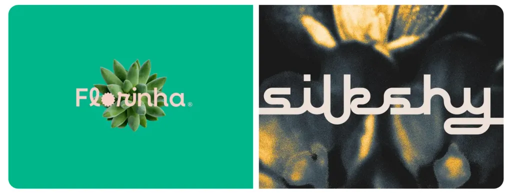
- Florinha da Nat
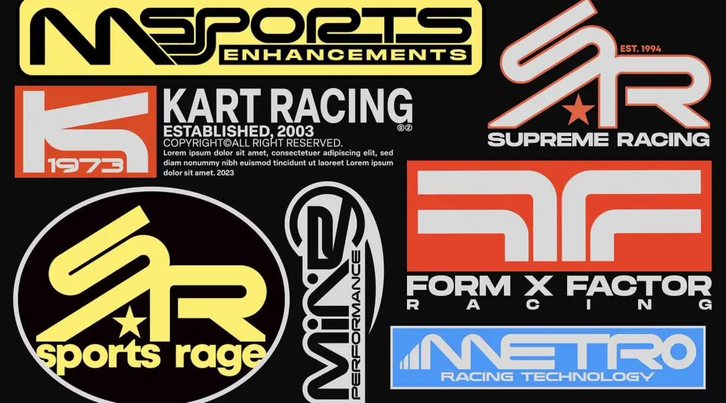
- KRAFT RACING TYPEFACE
- Silkshy – Script Display Font