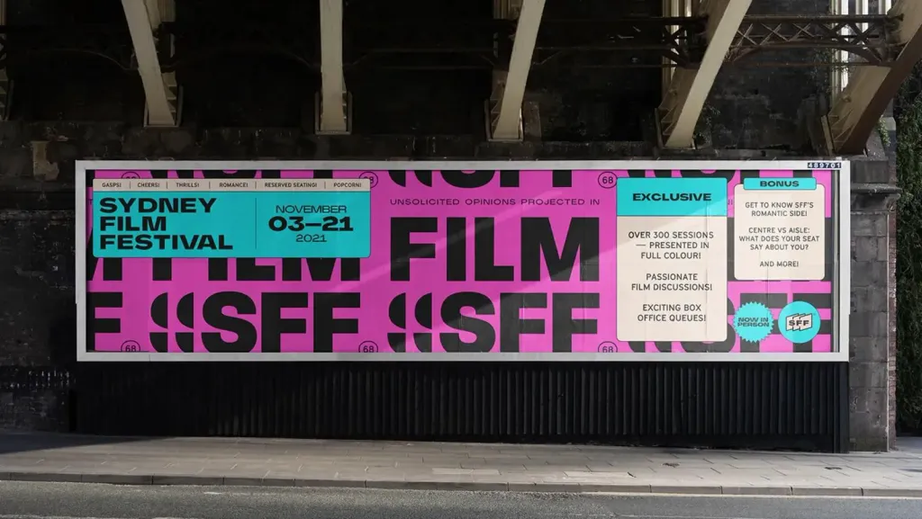
The main trends and directions in graphic design in 2024.
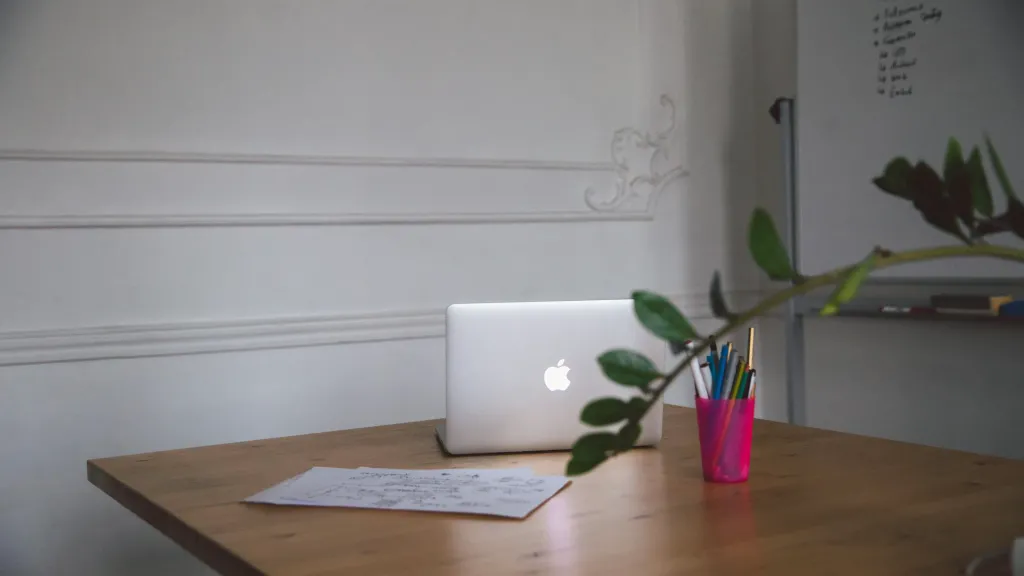
Natural materials
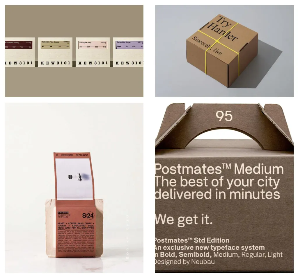
Environmentalism goes beyond the choice of environmentally friendly materials, it is a deep connection with nature that will reflect design in 2024. The charm of this trend lies in its natural aesthetics. Designers increasingly draw inspiration in organics, creating visual effects that resonate with the calmness and authenticity of nature. Packaging develops in a clean and natural design side with an emphasis on recycled materials and sustainable color palettes.
Bold minimalism
Minimalism, a timeless and sustainable graphic design trend that will probably never go out of fashion. Lately philosophy “less is more” is becoming even more popular. In this approach, each design element serves a specific purpose, without reveals the essence of excess. Minimalist design is characterized by clean lines, sufficient white space and laconic aesthetics There is a limited palette of colors and typography. As well as its adaptability to different environments, from websites to branding, makes it a universal choice for design projects.
Pixels
How to emphasize that your brand is modern, innovative and maybe even a little futuristic? Pixels are tiny bits of color square design blocks that offer a unique blend of nostalgia and modernity. The art of using pixels is no longer limited to retro video games, as it is now cool animations, artwork and branding of major companies. By the way, pixels are now displayed not only in the form of tiny cubes, but also in the form of large blocks.
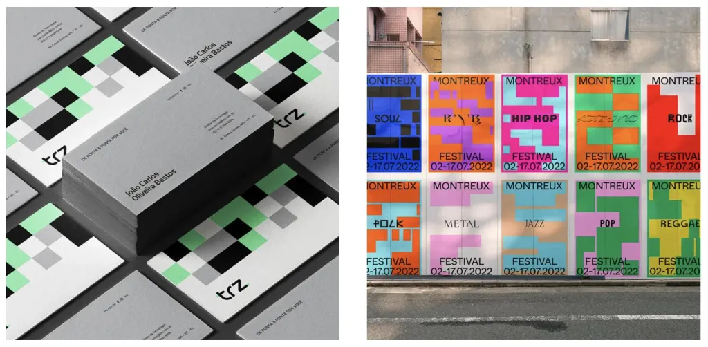
Utilitarian design
Utilitarian design is about functionality. Utilitarian design is aimed at simplifying interaction with the user by removing unnecessary elements. This can be achieved through minimalism, clear navigation and easy to understand content The design of something in this style immediately creates a certain solidity and trust in quality. Many people are reminded of this trend skeuomorphism, and it certainly has some similarities, as it translates the product into another environment using those the elements themselves.
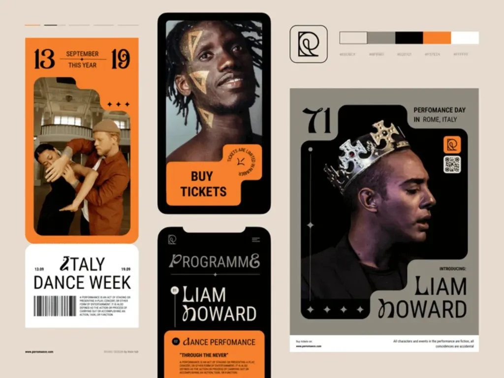
Doodles
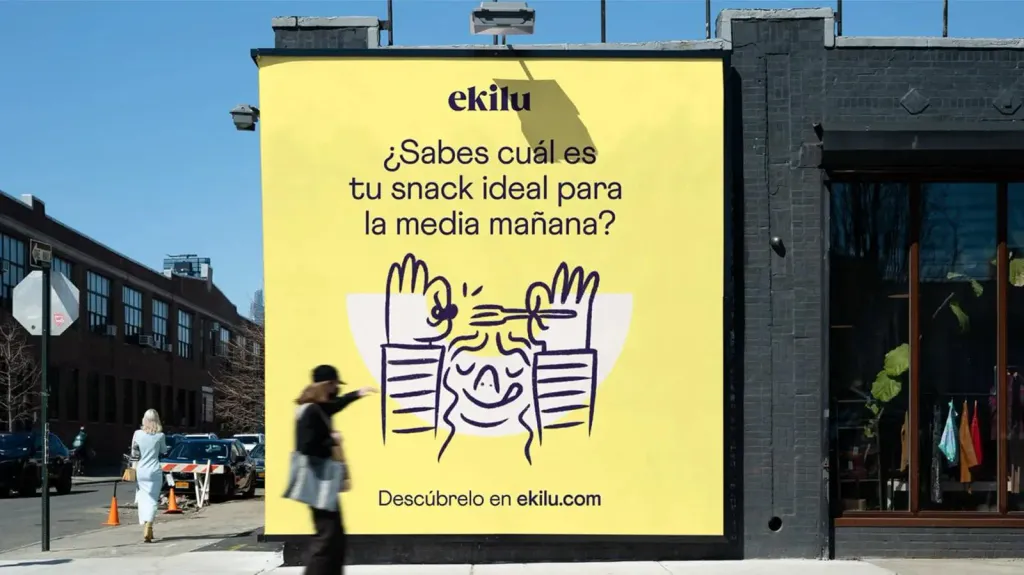
These hand-drawn, often whimsical and spontaneous illustrations add a touch of human personality to brands. Doodles are filling design with a sense of authenticity, as if the hand of the artist drew everything independently. From notebook fields to a digital canvas doodles always convey a certain playfulness and creativity. They can be subtle accents or take center stage in the composition, depending on the message and mood. In 2024, get ready to embrace this trend of understated and attractive the world of doodles and other styles of hand-drawn illustration, where each drawn line is a unique touch of imagination and character.
3D design
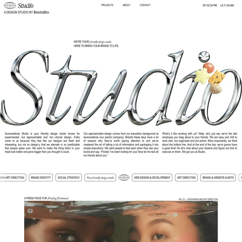
In 2024, the trend of three-dimensional graphic design will once again be in the spotlight. And what makes this trend special important is the accessibility it offers after the release of Adobe Illustrator’s “Inflate” function. Many years ago creation even a simple 3D element was only available to experienced 3D designers with professional software. However, Adobe simplified 3D design, allowing anyone to create from small elements to true 3D masterpieces.
Gradients
Gradients are versatile and can be used in a variety of applications, from backgrounds to typography and logos. Gradients are the perfect way to liven up your background instead of using a plain colored background. Visual effect gradient is so strong and recognizable that it can become the main element of your brand identity.
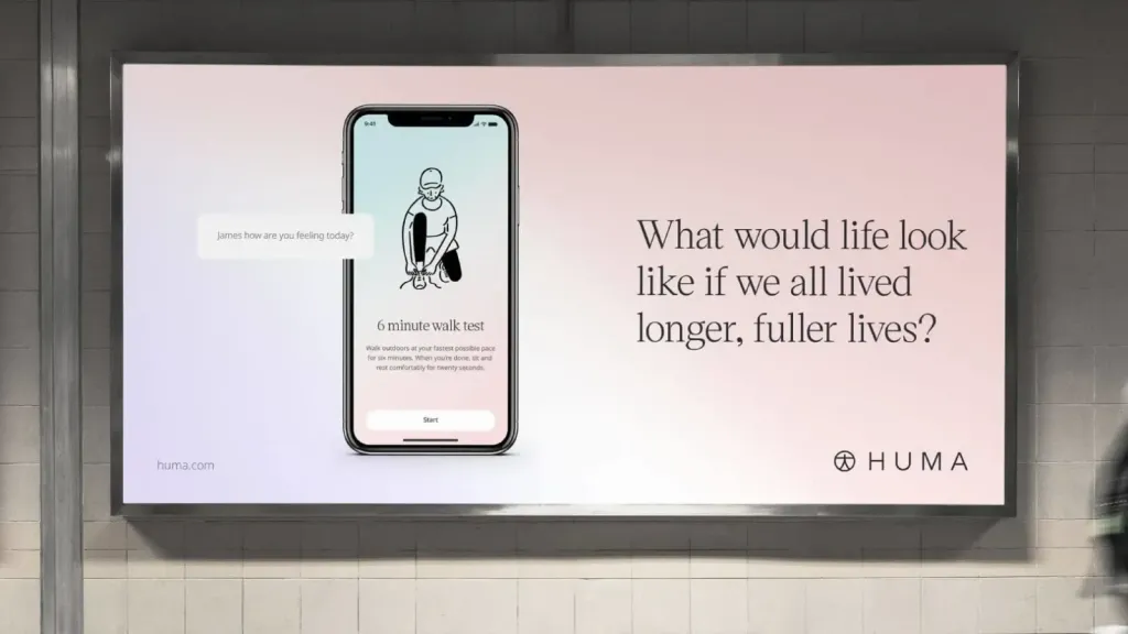
Company illustrations
This trend marks a shift from bland stock photos and visuals to personalized and unique images. Brands create individual illustrations that not only convey their values and personality, but also shape them a more authentic and intimate connection with the audience. These illustrations adapt to different mediums, from websites and social networks to packaging and advertising, bringing consistency to the brand’s visual identity.
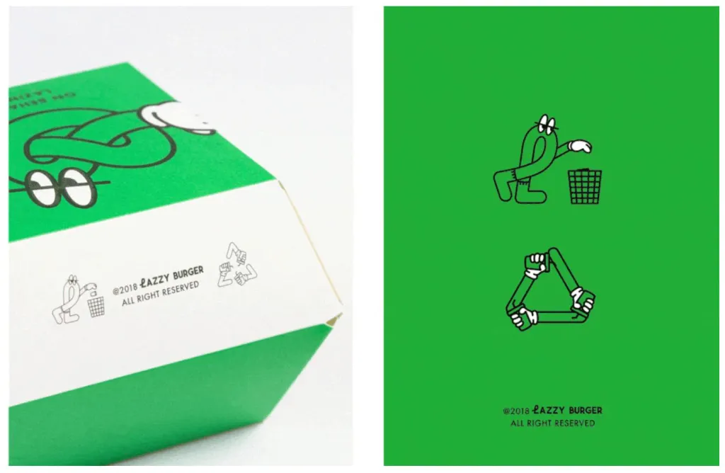
Serifs
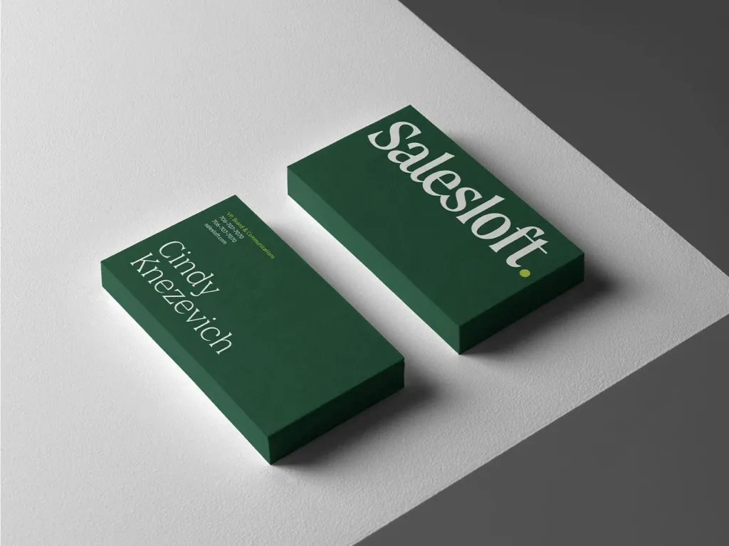
While serifs aren’t technically a visual style per se, serif fonts have taken center stage in trends of graphic design in 2023 and will become an even bigger trend in 2024. We are talking about the “sharp” serifs that we can see in the title of the “Strange Wonders” series, as well as their complete opposite, the rounded serifs used for “good”and “friendly” brands.
Photo
Photography is undoubtedly a key element of graphic design, both online and offline, it plays a key role in effective transmission of the message. Traditionally, this would have meant relying on stock photos, which often appeared flat and inanimate. However, the graphic design trend of 2024 will undergo significant changes. More and more designers are using original photographs or find inventive ways to use existing images.
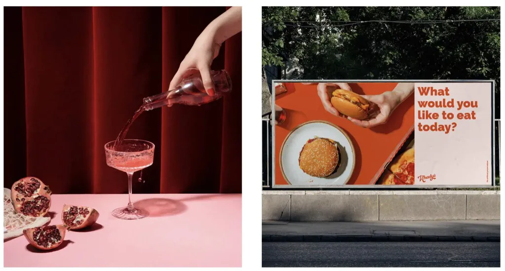
It’s not just about product photos; it’s about captivating images of people, nature and other elements that evoke strong emotions The momentum behind this trend is likely to continue in the coming years as companies strive stand out among competitors. Most likely, we will see more 3D images and interactive elements of AR/VR experiences, as well as images created by artificial intelligence.
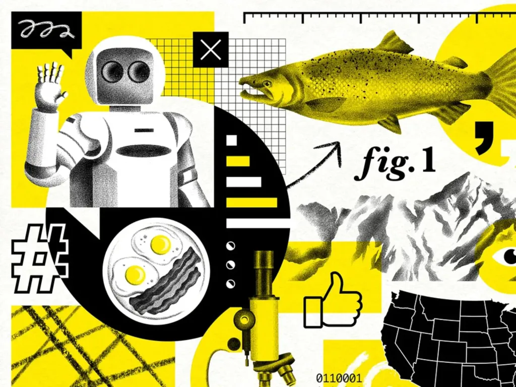
Collage
In the graphic design landscape of 2024, this artistic approach seamlessly blends a variety of images, shapes, and textures. Whether it’s a digital mosaic or a handmade masterpiece, collages bring a touch of rawness to designs. authenticity that cannot be achieved with perfectly aligned grids as we usually see. The use of mixed techniques and composition of the layout in a collage, undoubtedly brings this expressive aesthetic to the forefront of graphic trends design
Playfulness
From bright color schemes and unconventional typography to whimsical illustrations and interactive elements. It’s about to break the mold, use the unusual and explore. In an age where visual content competes for attention, playfulness definitely stands out as a way to create a pleasant and slightly childish design.
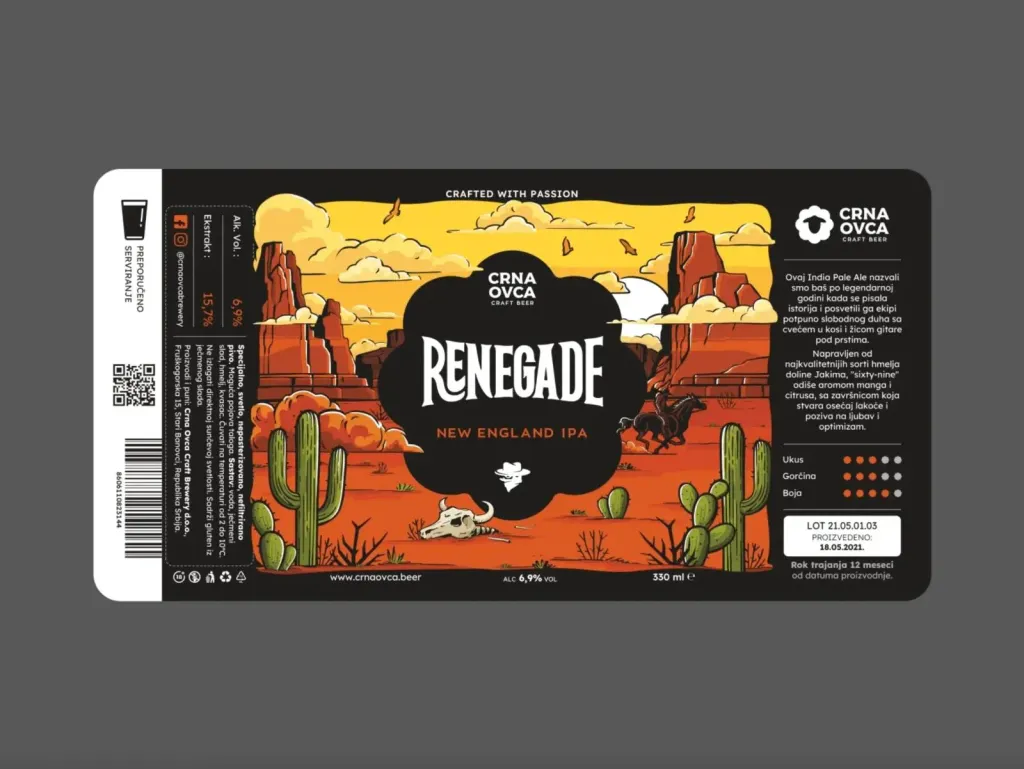
Retro
Retro designs are still one of the most popular trends. From rich orange and brown color palettes to the embrace of grainy photography and cartoon-inspired characters. The subtrend of minimalism is also gaining popularity, vintage minimalism. This hybrid approach combines the best of both worlds, removing unnecessary elements, leaving only the most necessary
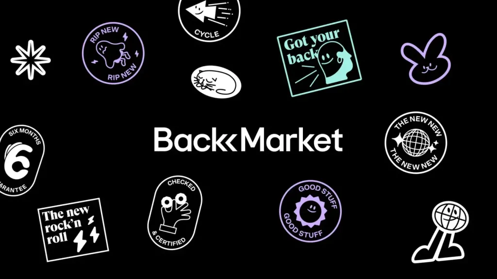
Stickers
This trend originates from the world of social media, where stickers have become a means of personal expression and communication. In design, sticker-like elements add a sense of individuality and vibrancy to visual compositions. Regardless whether it’s a digital burst of confetti, an emoji or a hand-drawn star. They add a touch of nostalgia and sentiment community, evoking the joy of personalizing and sharing visual stories.
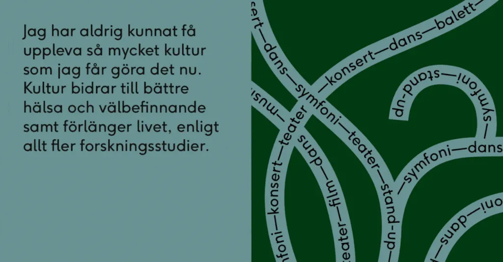
Non-standard typography
Another graphic design trend in 2024 that continues to grow is customizable typography. Handwritten dots custom fonts have long been artistic tools in a designer’s arsenal, but what’s really exciting is their popularity among the big brands that started mass customizing letters or even creating new typefaces. So next time, when you take on a typographic project, dare to make it one of a kind. Remember that fonts are called complement your design, not limit it.
RAW
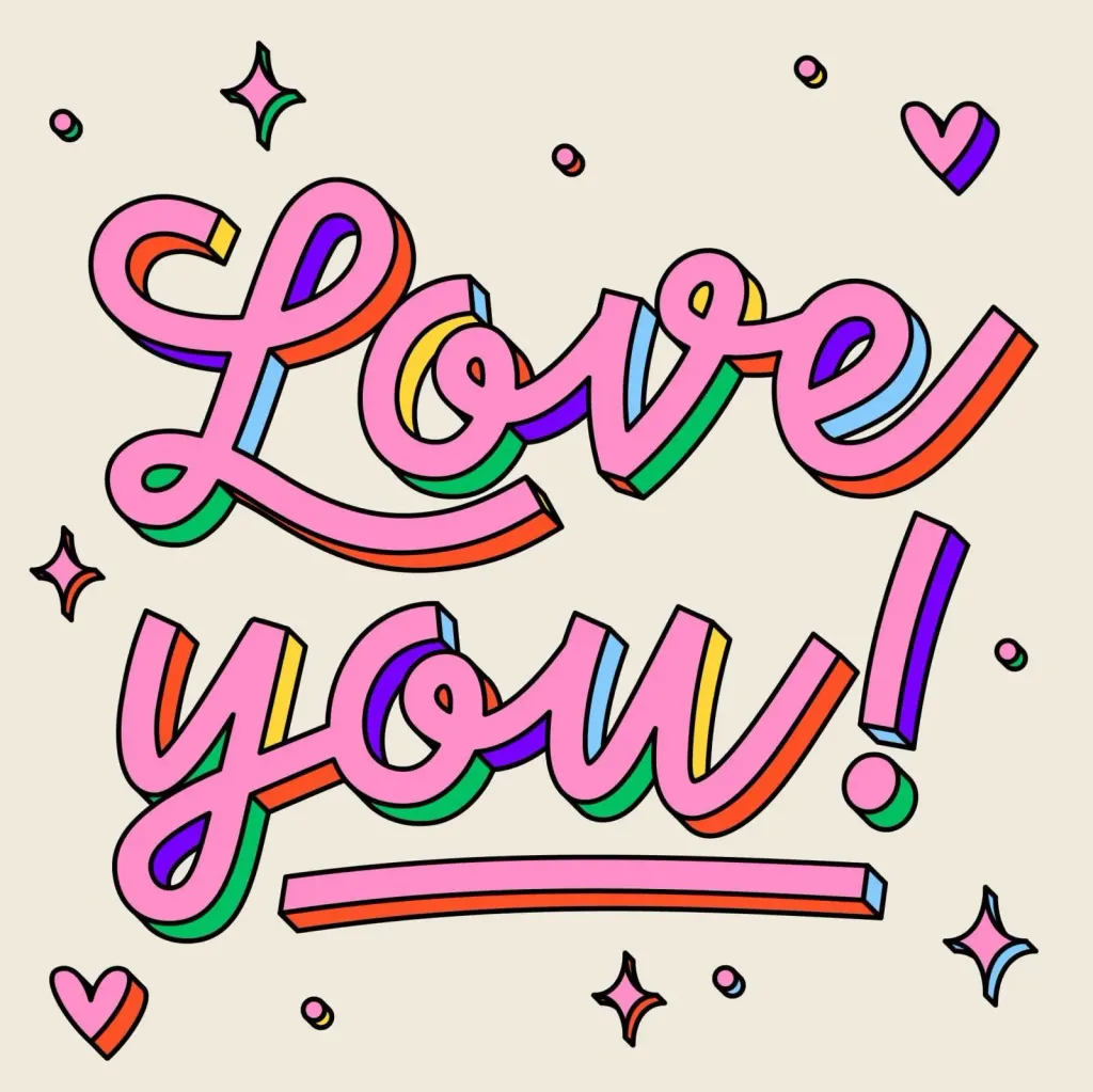
Styles such as cyberpunk, brutalism and anti-design have one thing in common - their roughness and incompleteness. Its often considered harsh or even cold, as well as strong and powerful. RAW is about breaking every rule imaginable. For example, using a variety of fonts and elements, excessive texturing, pixelated images, and random grids. The style is quite niche and won’t appeal to everyone, but if you want to make a bold statement with your design, then RAW is a great choice.
Maximalism
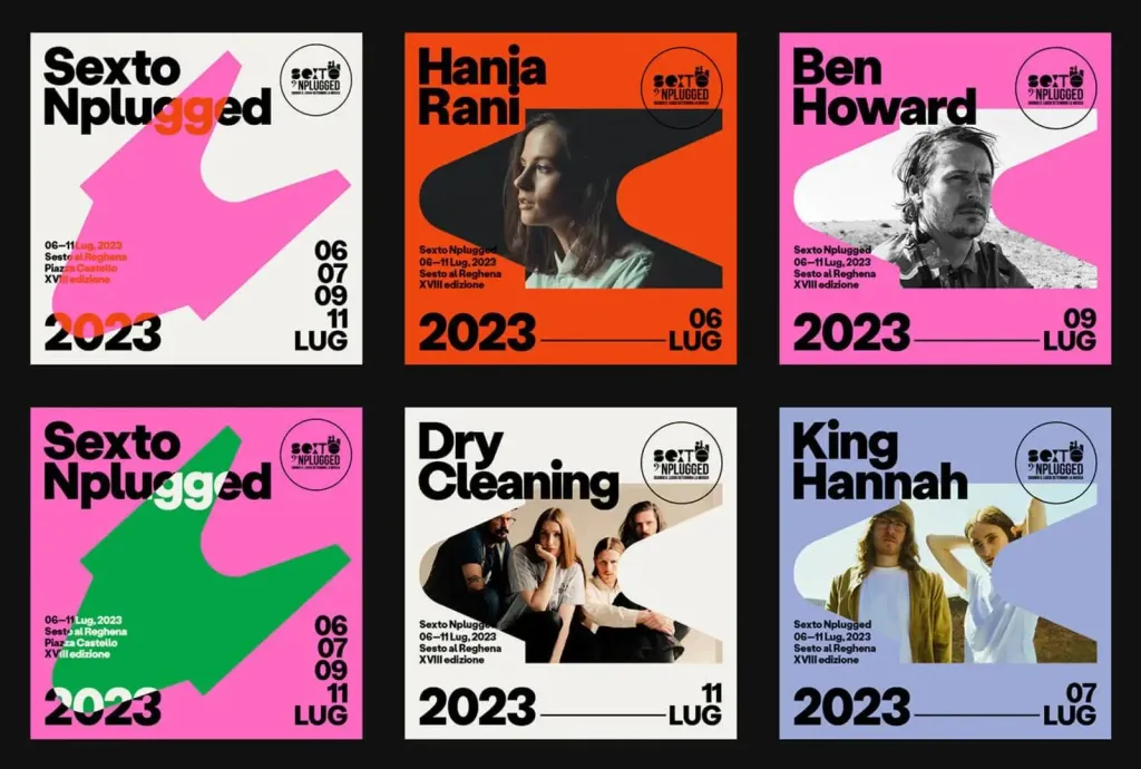
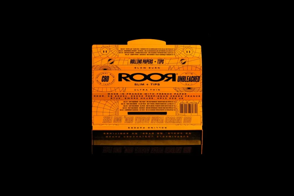
Although traditional design screams: “less is better”, maximalism believes that “more is more”. Through the use of bold color combinations, layered images, prominent typography and repetitive motifs, this style definitely attracts attention of users. One of the most mentioned projects when it comes to maximalism is the rebranding of The Public Theater Paula Sher from Pentagram. Use thick strokes, bright colors and large patterns and all the free space.s
