What approach to logo design will be most effective in 2024?

Logo trends are something mythical: almost everyone talks and writes about them. But have you seen them in action? Instead of giving theoretical advice, we decided to learn how real companies operate. Based on the information received, we identified 10 main ones areas that will be relevant in 2024.
I recommend that you don’t get hung up on the popular solutions that everyone is talking about, and figure out for yourself what’s going on. In order to To help you with this, we’ve studied hundreds of high-profile rebrands of 2023 and compiled an honest list of logo trends that are following most designers. This is a great starting point if you don’t know where to start!
The leading logo trend of recent years is dynamic minimalism in its various manifestations: from small independent projects on Behance to the grand rebrands of Citroen, Google or Sprite. Designers actively use restrained typography in combination with bright color palettes.
Most likely, these trends will continue in 2024. We hope to witness a global rethinking of this aesthetic. The flowering of typography in all possible forms awaits us. Logo designers cannot stand strict minimalism and symbolism — instead, the industry will continue to be flooded with fancy fonts. Of course, we have already seen many similar concepts, but this time, experimental typography will finally appear in real rebrands of real brands.
In addition, you will again meet some favorite logo trends of the last two years: sketches, vintage branding, bright colors and gradients.
1. Basic geometric shapes
In 2024, you are unlikely to impress anyone with complex graphics. Usually, such logos are poorly remembered, and the target audience it is difficult to associate in the head with the name of the company. This can be a problem for big brands whose goal is to increase awareness, so they prefer something more fundamental.
Basic geometric shapes - triangles, circles, squares, dots and lines give the logo a simplified look. As compensation designers can use a bright, high-contrast color palette (sometimes it is associated with the history of the brand even more than the logo itself). Or, on the contrary, make a choice in favor of monochrome and bring the minimalist effect to the maximum. Negative space is another great way to make simple geometry more original and interesting.
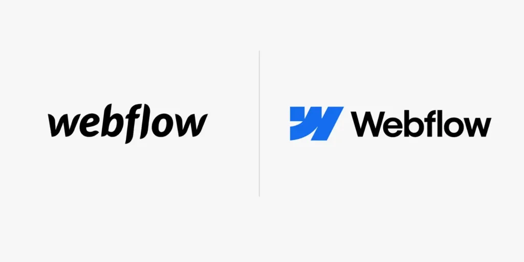
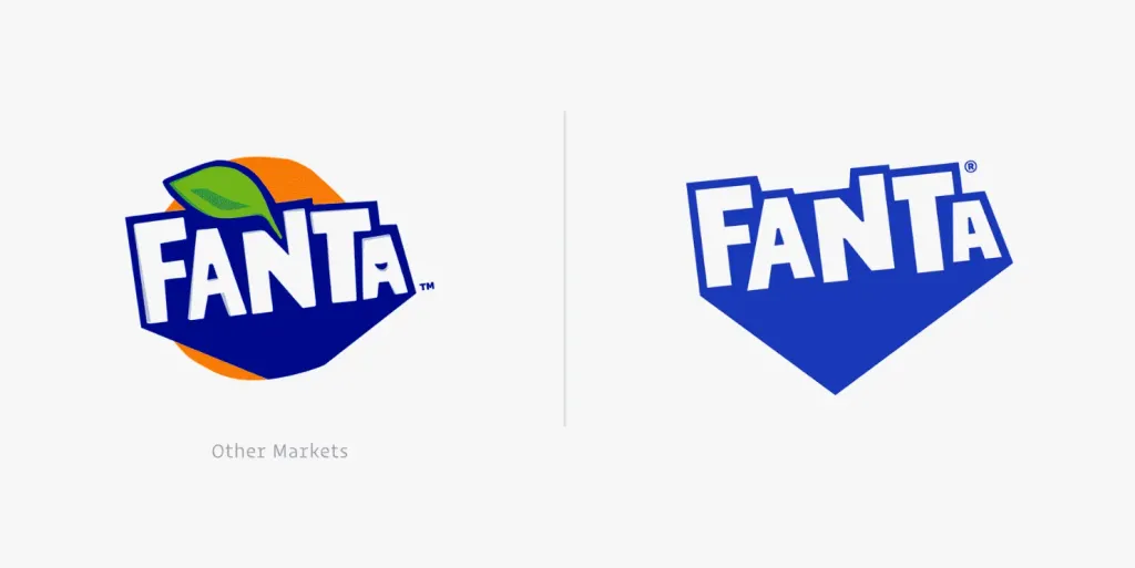
The principle “Less is more” cannot be called something new. For example, in 2021 KIA and Google changed the design of theirs logos (which were initially quite restrained) using simple forms. In 2022, the company presented a similar redesign Citroën. In 2023, even more companies followed suit, including Fanta (they ditched the iconic orange in favor of a combination of white and blue) and Webflow (WF Visual Sans + a simple geometric icon).
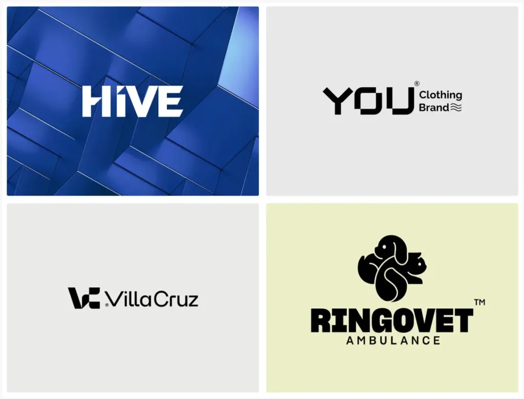
It is important that the trend for basic geometric shapes applies not only to the graphic, but also to the textual part of the logo!
Examples:
- New Logo, Identity, and Packaging for Fanta
- New Logo for Webflow
- Hive: Branding
- YOU® clothing brand
- ®Villa Cruz Design Studio
- Ringovet Ambulance
2. Bright colors and gradients
Experience shows that the choice of colors for a logo is a very personal story. Tracking the global trend is difficult. Someone gives prefer the black and white color scheme, someone chooses nude or earthy shades. However, if we pay attention to the big ones brands, we will notice a transition from muted to saturated colors.
Bright colors are difficult to work with. They attract a lot of attention, loudly declare themselves, but are poorly used with other elements of the design system. The designer must show all his skill so that rich tones look natural on the website, printed materials or in social networks.
Two illustrative examples are Abbyy and Creative Cloud. And while their success can be attributed to survivor’s error, many designers logos follow in their footsteps. Instead of choosing deep, muted colors, they turn up the saturation to the maximum and play with neon palettes, creating logos that captivate audiences at first glance.
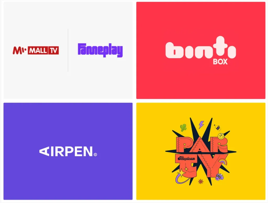
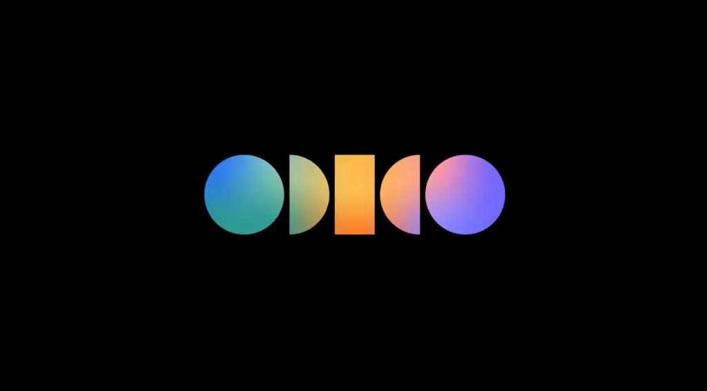
Another aspect of this trend is gradient logos, which have recently started to gain momentum. It seemed that the designers never will not return to them. But since 2020, a whole series of similar redesigns have taken place: from Avon’s two-tone gradients to Discovery channel gradient rainbow and the main Adobe logo.
Examples:
- New Brand and Identity for Odido
- New Logo and Identity for Fameplay
- New Logo and Identity for Binti Box
- Airpen — Make your ideas alive
- MEDITATION & HIKE — BRANDING&IDENTITY
- Cream Heroes
3. Vintage font logos
The vintage aesthetic trend was with us in 2023, and it’s not going anywhere. All these old-school fonts and countless projects on Behance with vintage typography have finally found their customers in various niches, from restaurants to healthcare.
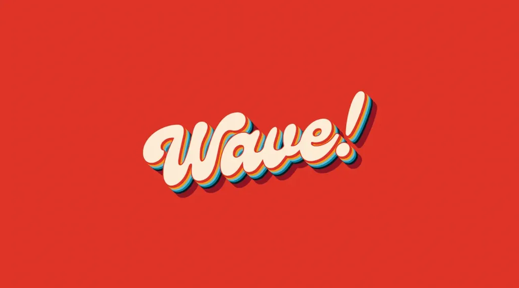
Despite the fact that sans-serif fonts are still used most often in logos, such is the widespread use retro aesthetics is impressive and gives hope for the emergence of fresh eclectic solutions. Even now we see one successful redesign after another, and throughout, 1960s-1980s-style fonts play a major role. They look stunning and attract all eyes.
A great sign for a logo trend is to go beyond independent studios and small businesses and engage a wide audience with your own vision of good design. In their opinion, the logo should first of all be clear and memorable, no frills. Therefore, even the very fact of increased interest in retro design means a lot.
In search of inspiration, it makes sense to look at Behance. There are many studios actively playing with experimental vintage typography and branding — so you’re sure to find someone who shares your sense of beauty. On the other hand, since the world is growing more interested in graphic design trends, we can count on some large companies “teleporting” their fonts logos in previous decades.
Examples:
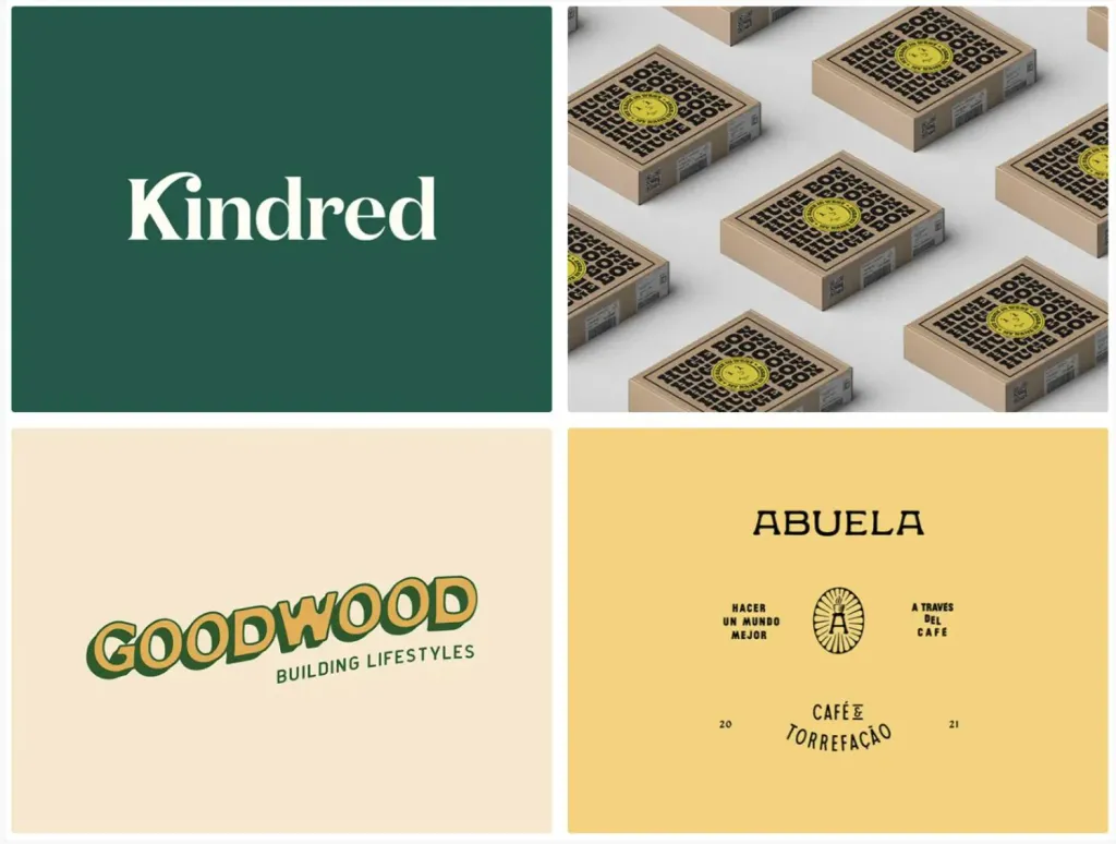
- New Logo and Identity for Kindred Health
-
WAVE branding - Huge Box — Brand Identity
- Coastal Lifestyle Brand Identity And Graphics Kit
- Abuela Coffee Roasters
4. Rejection of realism in favor of symbolism and minimalism
There are many trends in logo design related to simplicity and minimalism, and perhaps this one is the most prominent of them all. Yes, we have all at least once seen logos that look like works of art - animals, flowers, mythical creatures, coats of arms - they show craftsmanship and an interesting detail. Such logos really look amazing, but they lose to other types logos in terms of responsiveness.
Responsive logos are one of the most important “inventions” in branding. This approach allows you to use the logo without any obstacles on media of various sizes: from websites to mobile applications and printing. About six years ago it seemed revolutionary, but today hardly anyone considers responsive logos to be an independent phenomenon or trend. Instead, sensitivity has become natural property of the logo.
Detailed logos are bulky and awkward, especially when we place them on small screens or business cards. And here to help simplified versions or new minimalist logos are coming, which save designers a lot of time and effort. We can create one logo that will look good everywhere.
By and large, this trend is not about visual beauty and style, but about convenience. The main thing is flexibility, and a refined exterior appearance is a bonus, not an end in itself.
Examples:
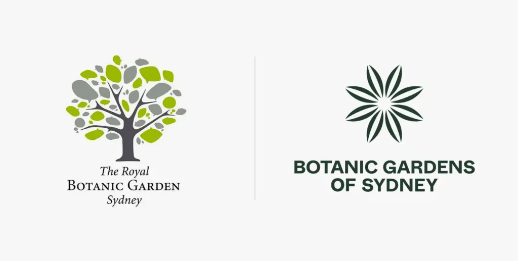
- New Logo for Botanic Gardens of Sydney
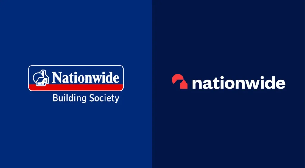
- New Logo and Identity for Nationwide
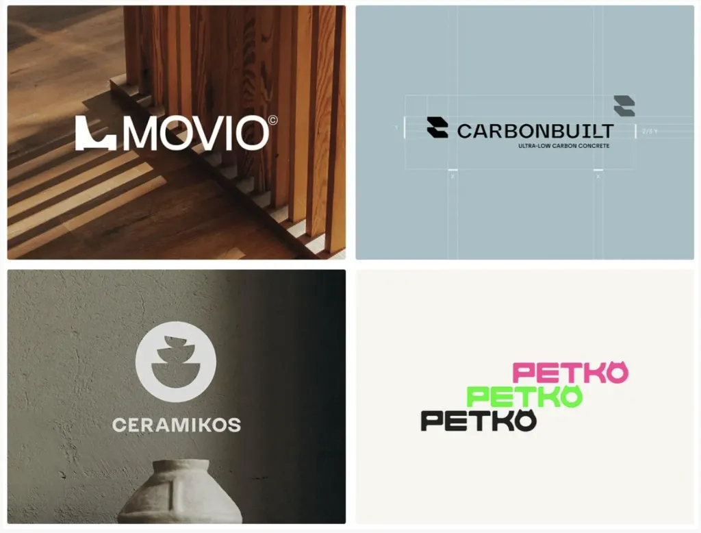
- MOVIO – Logo Design I Furniture & Interiors Branding
- CarbonBuilt Visual Identity
- Ceramicos — Logo design
- PETKO — VISUAL BRAND IDENTITY
5. Typography with a highlight
In 2023, we constantly encountered experimental typography - glitch, waves, chrome, etc. Such decisions will remain in trendy and 2024.
It took two years for logo designers to figure out how to use fancy letters in their designs. It all started from original concepts - creative minds played with the most outrageous fonts, unexpected combinations of colors, patterns and graphics.
Their work was first appreciated by those entrepreneurs who are always not against trying something new: hipster cosmetic brands, breweries and street food. Then something impossible happened: last year, the German chocolate brand Nucao changed its understandable logo, which well readable, serifed on the logo with an experimental font. That was really a turning point.
Nucao is not the only company that has taken such a step. It was followed by delivery services, food manufacturers, and supermarkets and other businesses aimed at a wide audience. Every month there are more and more rebrandings, and how many more are waiting for we are ahead!
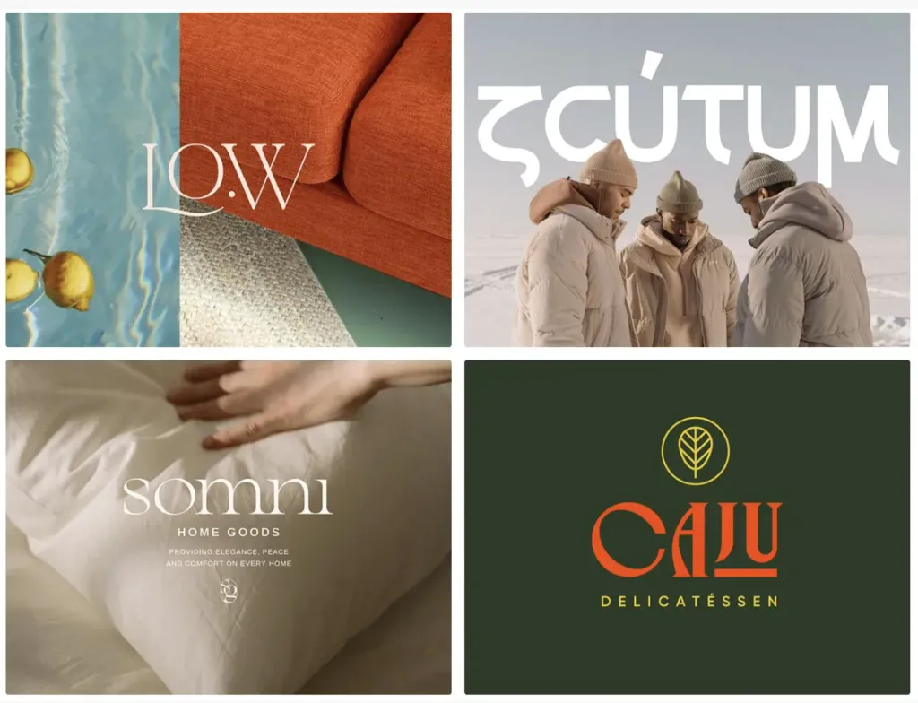
Artistic typography will be an outlet for lovers of serif fonts. Although they are now considered immortal classics, rather than a trend, you can always do some experiments and add some unexpected details.
Examples:
- RISE
- LO.W
- SCUTUM — Logo & Branding Creation
- SOMNI — Home goods logo design
- Caju Delicatéssen
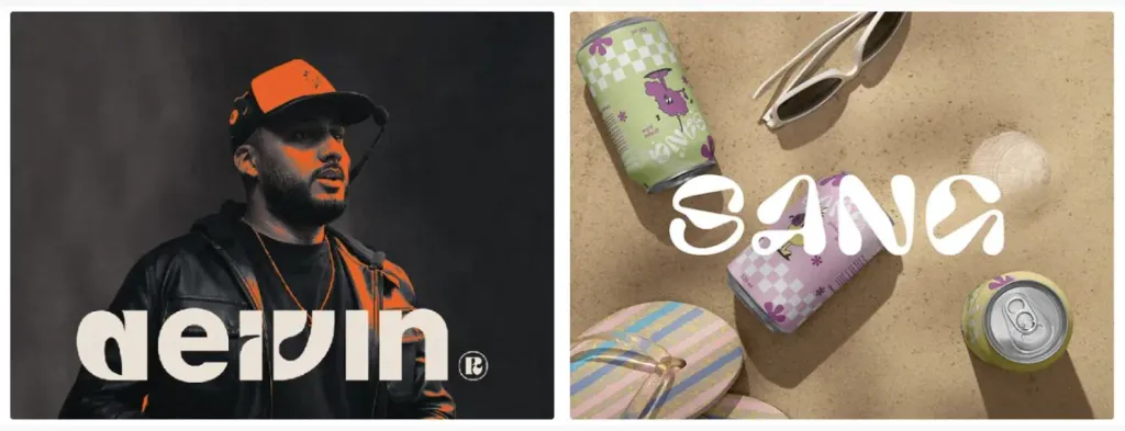
- deivin
- SANG — PACKAGING DESIGN — DESIGN & BRAND IDENTITY
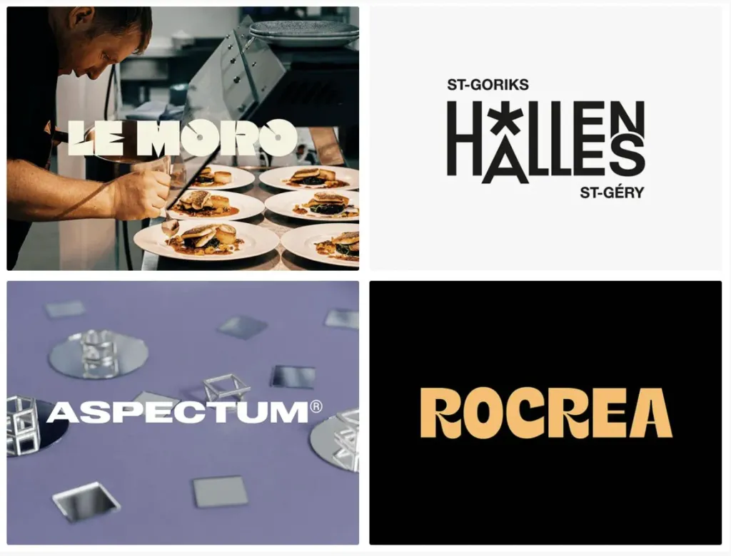
6. Logos without serifs
If experimental typography is a bold trend that not everyone will like, then sans-serif fonts are familiar and understood by all. Many designers are abandoning fancy fonts in favor of minimalist grotesques. This trend will remain in 2024.
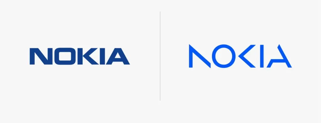
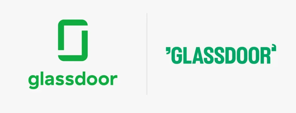
Sans serif fonts are much easier to adapt to different sizes and media, so they are more suitable for creating responsive designs logos. It is interesting that a few years ago we observed the reverse process: many companies abandoned grotesques in favor of serif fonts to add a retro touch to your identity. Today, despite the return of retromania, discreet font logos, as before, remain relevant and perfectly cope with their tasks.
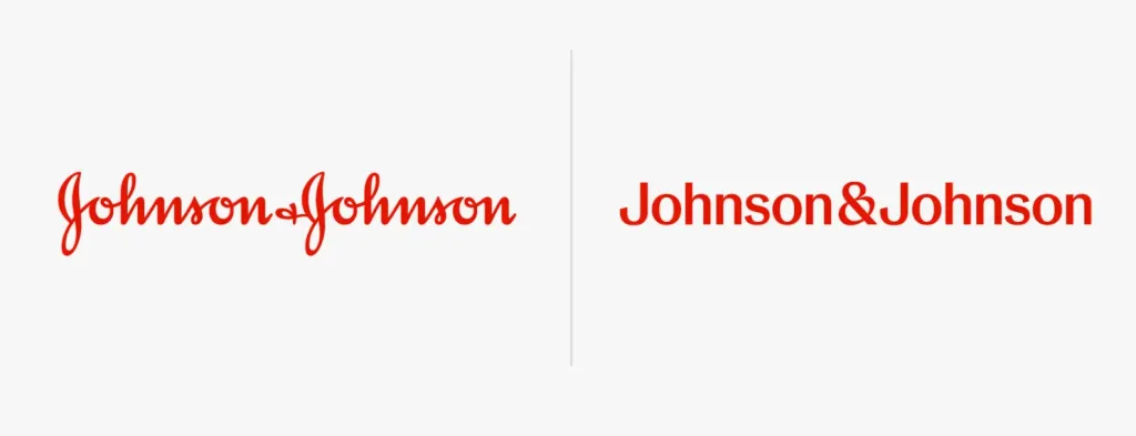
If you think sans serif is boring, chances are you haven’t discovered the whole world of grotesques from their various drawings and styles. Recently, several companies have abandoned serif fonts in favor of typefaces without serifs, and the result was simply stunning. So, with a competent approach, grotesques can attract attention audience better than the fanciest font.
Examples:
- New Logo and Identity for Glassdoor
- New Logo for Johnson & Johnson
- New Logo and Identity for Nokia
- LE MORO Restaurant branding&identity
- Halles Saint Géry Brand identity
- ASPECTUM®
- Rocrea Furniture — Branding & Visual Identity
7. Abbreviations and emblems
Experiments with minimalism could not bypass letter logos. Designers did not pay attention to them for a long time. Maybe because that their ascetic appearance did not fit into the general design landscape. However, the latest logo trends show that even one a letter can combine aesthetics and functionality.
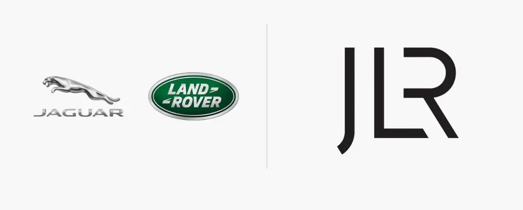
Letter logos and emblems are often overshadowed by more prominent vintage logos and experimental typography. However, when it comes to practicality, they are second to none. They take up little space, are perfectly combined with other elements, and adapting them to small screens or business cards is easier. If you want to create something big, bright, expressive, this trend is hardly for you. But remember: design ≠ beautiful pictures!
From this moment, working with letter logos takes on a new meaning: we need to express the entire philosophy of the brand in one element, his tone of voice. And at the same time, create something as attractive as possible, which meets the aesthetic needs of the target audience. Sounds like a challenge, right?
Examples:
- New Name and Logo for JLR
- Taiwan Design Expo 2023
- Manor brand identity
- New Logo and Identity for Harvard Graduate School of Design
- JOMKINO — Logo design and brand identity
8. Doodles
Doodles and doodles are one of the most visible logo trends of the coming year. Although it may seem that he has already exhausted himself, recent projects indicate otherwise. This is exactly what you need if you want to add personality and humanity to your design.

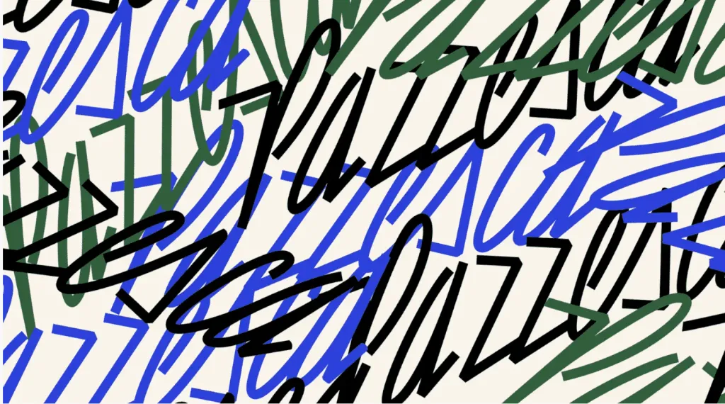
In 2024, looser shapes, doodles and sloppy cartoon characters will be in trend. Some brands have already become owners similar logos. Their main feature is a “raw”, unfinished look. And even if you are a lover of minimalism and traditional aesthetics, such a return in the mid-2010s can be a great way to express yourself.
Examples:
- Pazzesca
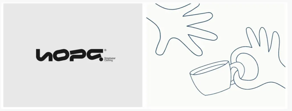
- HOPE® streetwear brand
- BAKE&CUP — LOGO DESIGN & BRAND IDENTITY
- LAGO identity
The best redesigns of 2023
The year 2023 can boast of several notable redesigns, which partially set the trends for the next year. We studied creative the experience of leading companies to understand what visual solutions they use and then identify general trends.
Of course, on Behance and Dribbble you can find many fresh, outstanding projects that immediately attract attention. However only a few reach a wide audience and have a big impact on our industry.

But there are exceptions! For example, the popularity of vintage logos and experimental typography is the merit of independent studios and designers. But let’s get back to the most interesting redesigns of the year!
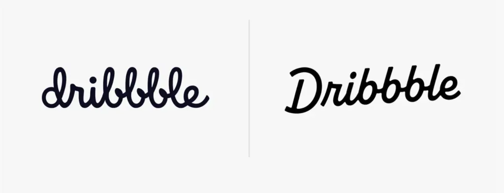
In September, Dribbble unveiled its new logo inspired by 50s typography. Such a retro aesthetic liked by many and eventually became one of the main logo trends of 2024.
The basis of most of this year’s redesigns is typography. More specifically, creative typography, such as logos Toggle and Meridian. Both there and there, the central element is a sans-serif font. These redesigns prove that grotesques can be spectacular and not at all boring..
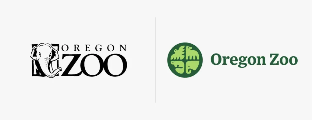
The Oregon Zoo’s new logo is the clearest proof that symbolism is taking over the market. Away with realistic graphics signs and extra details! And although they chose a rather traditional font, it did not spoil the final result.
Logo trends that will remain in the past
Of course, there is no clear boundary separating the 2023 and 2024 trends. Most of the solutions remain popular for more than the first year, therefore, you should not wait for any radical changes.
However, it is safe to say that, for example, negative space or 3D, which were extremely popular before, are unlikely to become the protagonists of this season’s logo design.
The fate of any trend depends on many factors. Art deco, Scandinavian style, boho could not assert themselves in 2023, as many brands and designers sought pragmatism on the one hand and a new artistic vision on the other. The same can happen with any trend from our list. And how successful or unsuccessful a specific logo turned out — up to the users.