Styles in graphic design

Graphic design is a dynamic field that reflects the changes taking place in society: From cultural trends to technological progress, and style is a unique approach to communicating with the audience.
The world of graphic design is constantly changing - from the intricate modernism of the early 20th century to the trendy styles that that surround us today. In this article, we will explore how historical events, technological advances, and cultural shifts have shaped different styles of graphic design graphic design styles in the past and continue to shape them today.
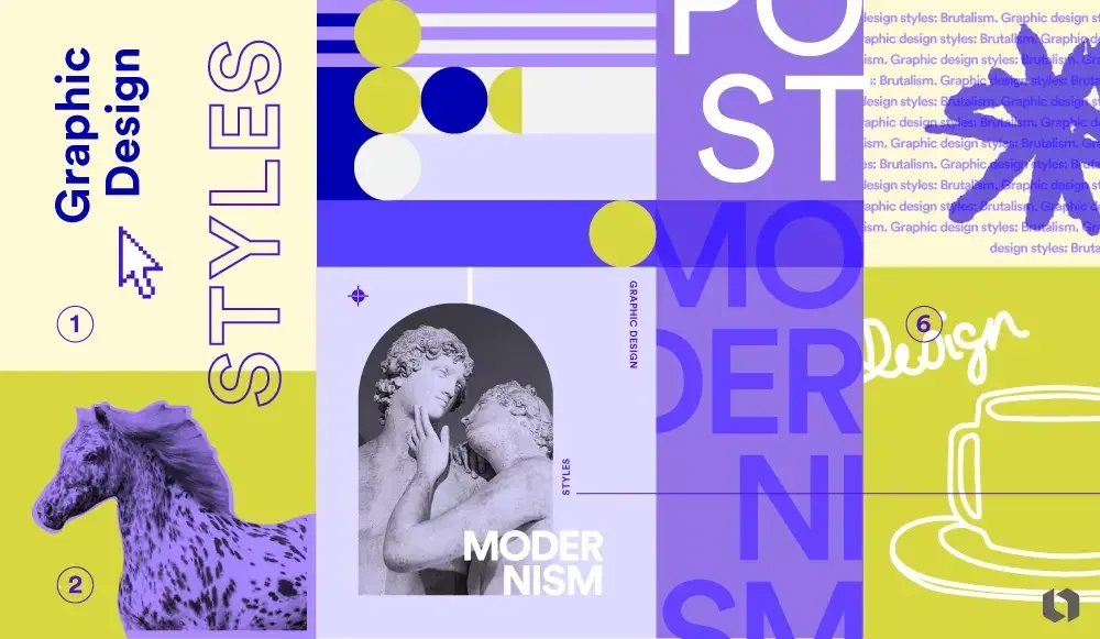
What is style in graphic design?
Style is a unique approach to communicating with the audience. Each style conveys a message to people through colors, composition, fonts, images, and other visual elements.
What factors influence the formation and development of styles:
-
Cultural context: Traditions, beliefs, and social norms largely determine aesthetic preferences. Colors, symbols and images reflect societal values and ideas.
-
Technology: With the development of technology, the range of tools available to designers is constantly expanding: from the printing press to the latest printing press to the latest AI services.
-
Artistic movements: Historical and contemporary art movements inspire graphic designers. Each of them opens up new approaches and techniques.
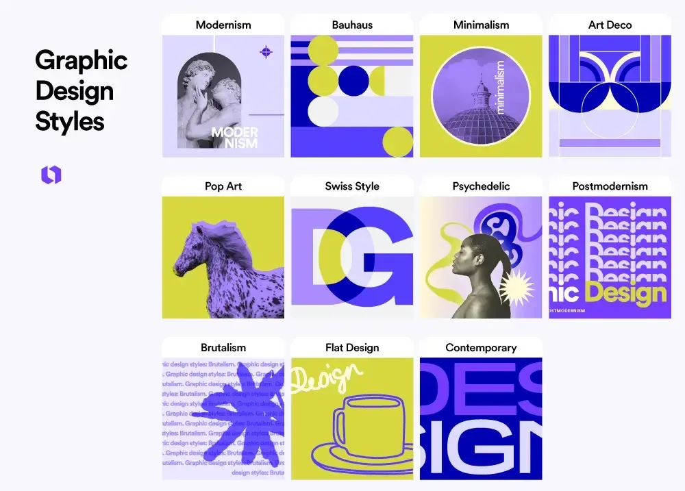
1. Modernism
Modernism is not a specific style, but a whole trend that marks a shift towards abstraction, simplification, and the rejection of from the intricate, ornamental styles that preceded it.
At the beginning of the 20th century, designers and artists sought to move away from traditional forms and conventions, prioritizing functionality, clarity, and simplicity.
At the heart of modernism was the belief that design should reflect the spirit of the era, including rapid progress in industry and technology.
Movements such as the Bauhaus, Swiss style, and minimalism were born during this period. We will take a closer look at them below.
Characteristic features of modernism
-
Sans serif fonts: Clean, legible grotesques have replaced the decorative serifs of the past, shifting the emphasis on readability and a modern look.
-
Geometric shapes: Basic geometric shapes such as circles, squares, and triangles help create abstract functional designs.
-
Grids: Grids allow you to structure and align elements, making your layout logical and orderly.
-
Contrasting colors: Bright, contrasting color combinations attract attention and create visual interest.
Inspiring examples:
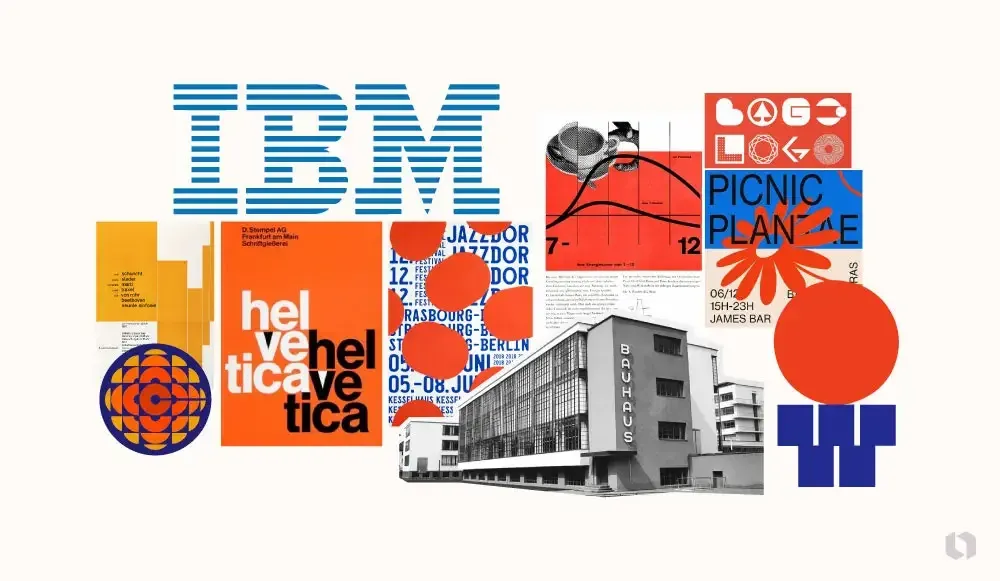
- Bauhaus School: It was founded in 1919. Teachers and students have created many iconic works, prioritizing functionality and simplified forms.
- Swiss style: Known as an international typographic style. The main elements are grids, sans-serif fonts, and photographs.
- Paul Rand’s identity for IBM: Rand’s work is a prime example of modernist design with clean lines, bright colors, and the iconic colors and an iconic logo that is still relevant today.
2. Bauhaus
The Bauhaus style originated in the school of the same name, which operated in Germany in the first half of the 20th century. It was created by by Walter Gropius as a response to the decorative excesses of Art Nouveau (or Art Deco; not to be confused with Modernism!). Designers felt that this approach no longer met the social and technological needs of the era.
The Bauhaus style is based on the concept of “form follows function” - this principle puts the design task at the heart of the design, rather than aesthetics.
The Bauhaus combined art, craft and technology to create functional and affordable products for mass production. for mass production. Its main goal was to serve society.
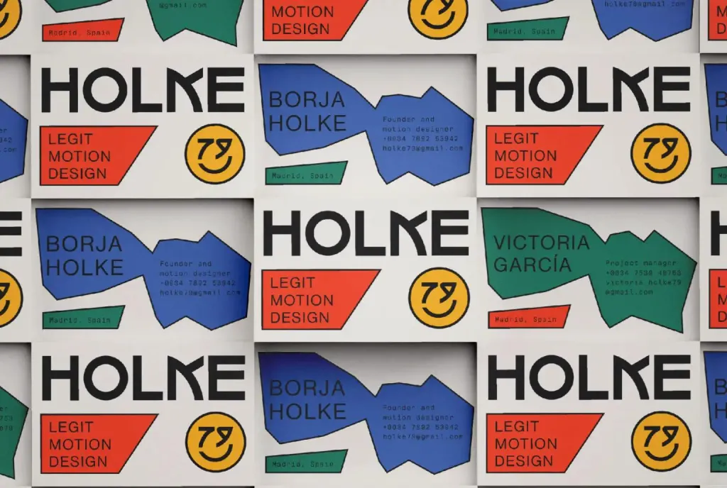

Characteristic features of the Bauhaus style:
- Geometric shapes
- Clean lines
- Limited color palette, primary colors (red, yellow, blue)
- Readable sans serif fonts
Inspiring examples:
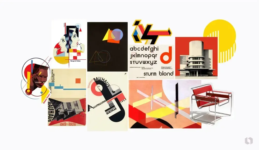
- The Universal typeface by Herbert Bayer: The geometric grotesque created by Bayer is the embodiment of functionality and simplicity. The uniformity of the glyphs and the absence of capital letters were radical decisions at the time.
- Bauhaus exhibition posters: Bright colors, geometric shapes, and asymmetry - these posters were characterized by visual harmony and simplicity and served as a means of expressing the Bauhaus aesthetic.
- Furniture by Marcel Breuer: The Wassily chair (legend has it that it was named after Kandinsky) is an example of how the ideals of the Bauhaus ideals were applied beyond graphic design.
3. Minimalism
The main principle of minimalism is simplicity. Its roots date back to the early twentieth century, but this style became mainstream only in the 1960s. in the 1960s. The idea is that we should leave only the essentials in the design to improve the user experience users’ experience and make our message clearer and more understandable.
Iconic designer Dieter Rams said: “Good design is as little design as possible”. His approach to work and philosophy have largely shaped modern minimalism.
The minimalist style increases the transparency of communication and helps to create a modern aesthetic. Negative space, color and typography become the most important tools for effective communication.

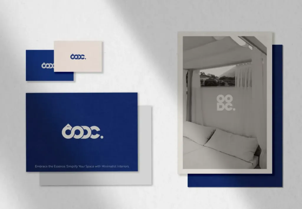
Characteristic features of minimalism:
- Simplicity: Only the main components are in focus.
- Clean lines and negative space: Plenty of air and clean lines help draw attention to the main components.
- Limited color palette: Doesn’t distract the eye and helps maintain concentration.
- Simple, often massive typography: The absence of frills and decorative details is the key to effective communication.
Inspiring examples:
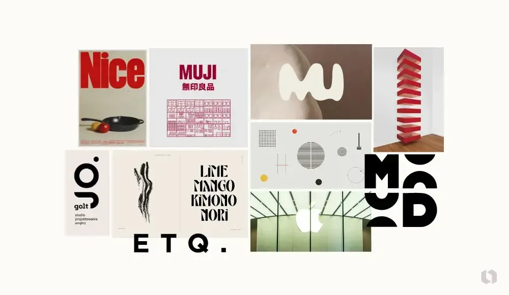
- Apple branding and product design: Apple is known for its minimalist approach: from elegant product design to laconic advertising layouts.
- MUJI (a Japanese retailer) is another example of minimalism in product design, branding, and advertising. Their approach is simple natural backgrounds with an emphasis on the product and a minimum of text.
- ETQ Amsterdam: A minimalist clothing and footwear brand that stands out in the fashion world for its simplicity and focus on quality.
4. Art Deco
Art Deco, a style characterized by rich geometric ornaments and monumentality, emerged in the early 20th century and reached its peak in the 1920s. Originating in France, it quickly spread around the world, influencing architecture, fashion, and especially interior design, interior design, fashion and, most importantly, graphic design.
Art Deco is the embodiment of luxury, glamor, and affluence of the 20th century.
The new aesthetic reflected the technological progress and optimism prevailing in society after the First World War. During this period, the hand-drawn flowing lines of Art Nouveau gave way to the geometry and rigor of Art Deco.
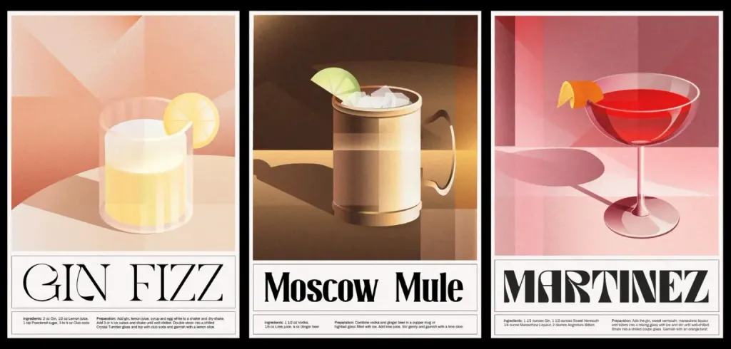

Характерні риси ар-деко :
- Geometric shapes: Art Deco is famous for its use of bold, often angular geometric shapes such as triangles rectangles, and zigzags.
- Saturated colors: In contrast to the minimalist color palette often found in modern design, Art Deco is characterized by deep and vibrant colors.
- Luxury and glamor: This style exudes an atmosphere of luxury, and you can often find glossy surfaces, metallic shades (gold and silver) and fanciful images.
- Symmetry: Balance and symmetry are the key principles of Art Deco, and they help to create orderly and harmonious compositions.
Inspiring examples:
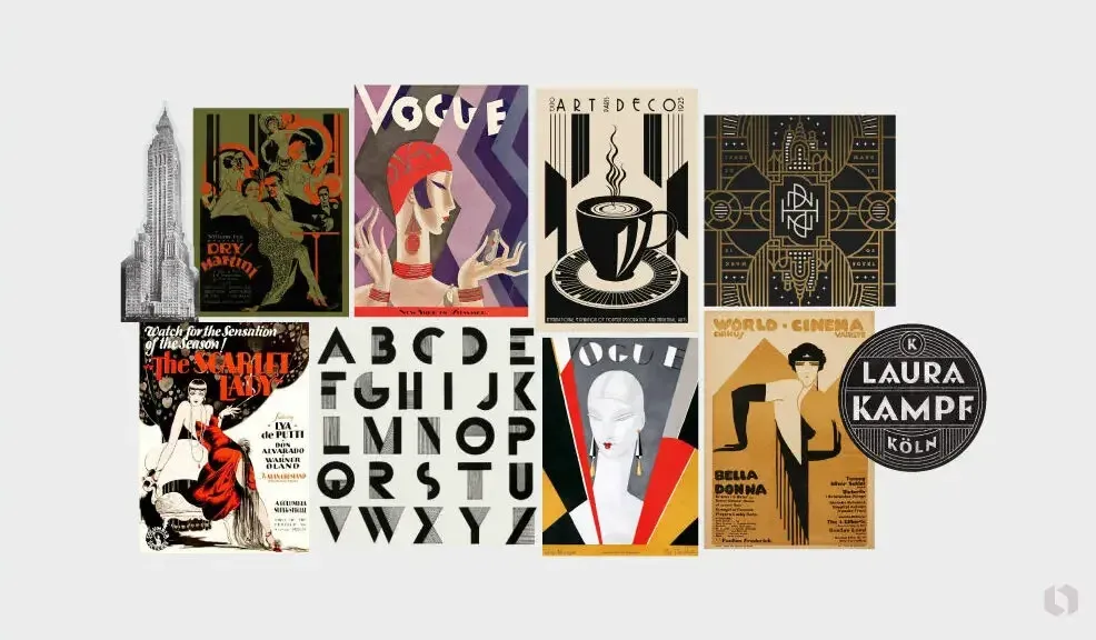
- Movie posters of the 1920s and 1930s: Many classic movie posters from this era feature stylization and geometric patterns, characteristic of Art Deco.
- Empire State Building and Chrysler Building: The iconic décor of these buildings has served as a source of inspiration for countless Art Deco designs, including posters and book covers.
- Vogue magazine covers: In the 1920s and 1930s, Vogue magazine covers often featured Art Deco designs: bold lines, symmetry, and glamorous aesthetics.
5. Pop art
You’ve probably seen the neon-colored portraits of Marilyn Monroe or the iconic Campbell’s soup cans created by Andy Warhol. This is the quintessence of pop art! The style emerged in the mid-20th century, challenging traditional fine art.
The starting point of pop art was the emergence of mass production technologies. Artists and designers turned ordinary consumer goods into art objects, blurring the lines between advertising and fine art!
The movement originated in the 1950s in the UK and later spread to the US. This era made the creation of works of artwork accessible to the general public. It changed public opinion about what art could be.
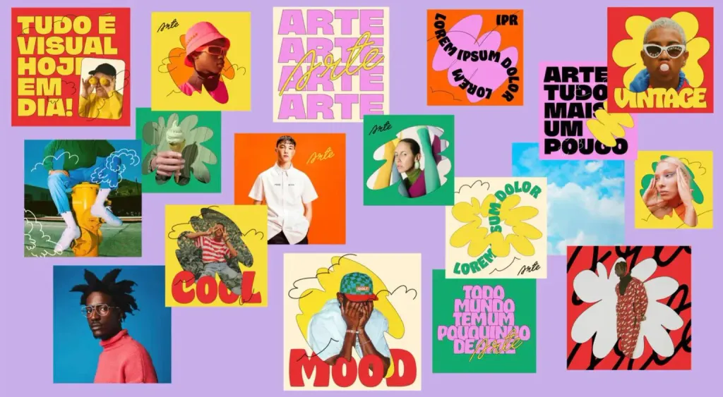
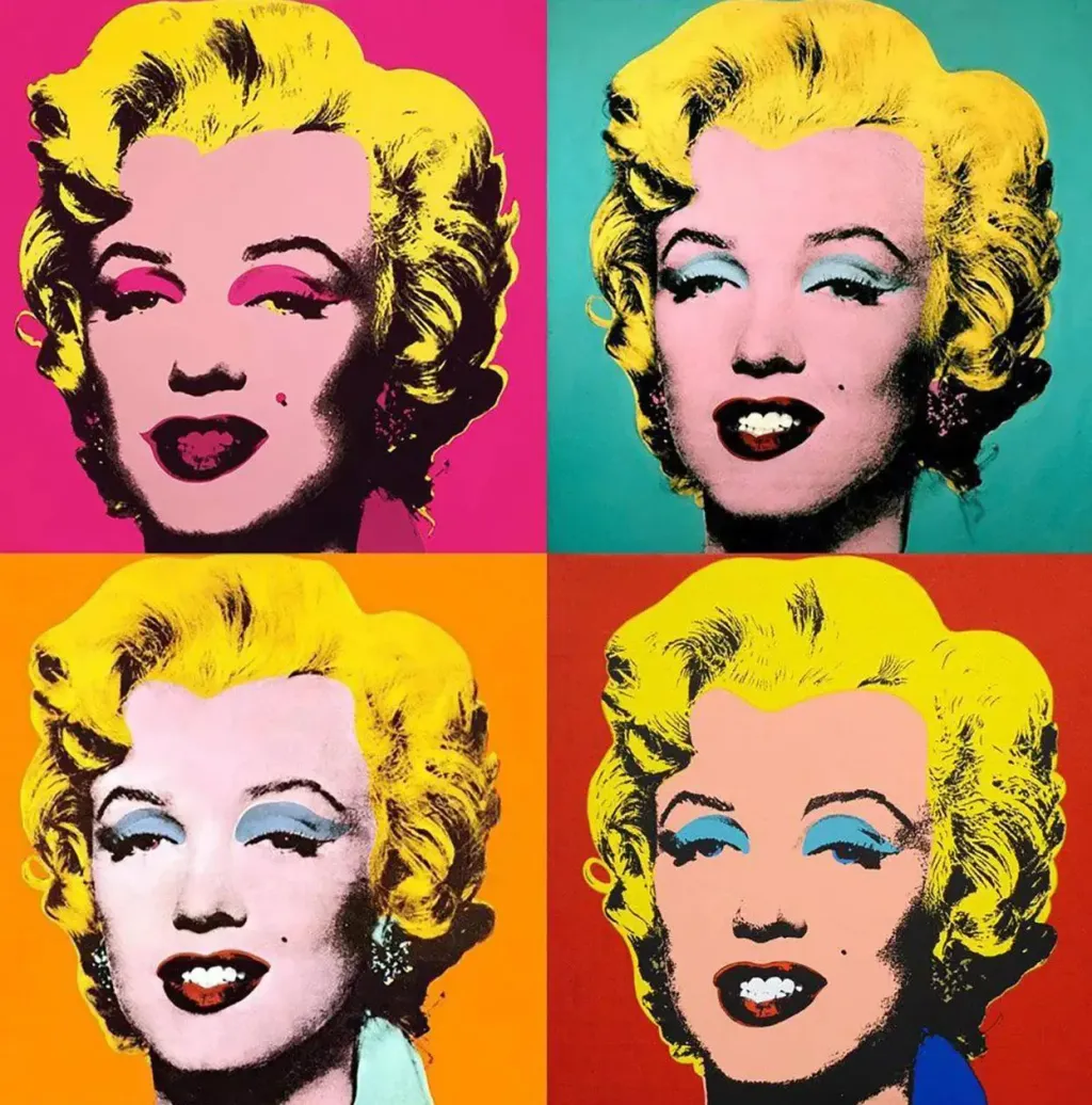
Characteristic features of pop art:
- Bright contrasting colors attract attention and evoke emotions.
- Use of mass culture images from television, advertising, comics, and even everyday objects.
- Irony and satire: Artists and designers often turn to humor, irony, and parody to make a point about contemporary culture and society.
- Simple massive lines and shapes make the style easily recognizable and memorable.
Inspiring examples:
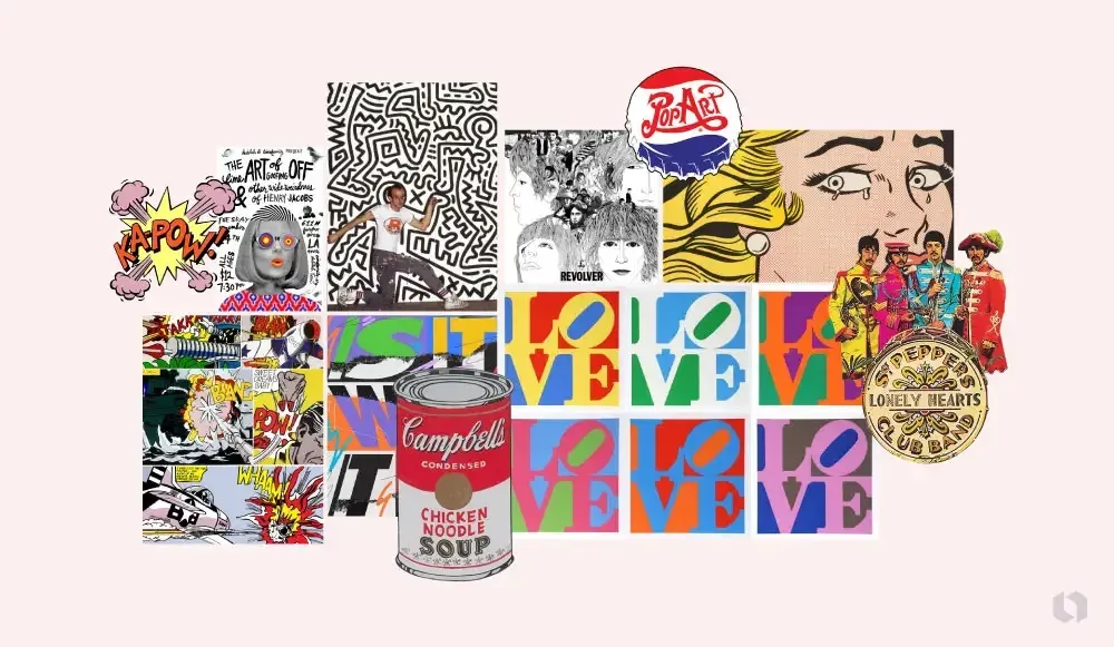
- Andy Warhol’s Campbell soup cans: This iconic series of Warhol’s works radically changed the idea of what can be considered art.
- Roy Lichtenstein’s comics: Lichtenstein transformed scenes from comic books into full-fledged works of art, using the primary colors and Ben-Day dots typical of 1960s comics.
- Album covers by the Beatles: The Beatles’ pop art album covers, including Revolver and Sgt. Pepper’s Lonely Hearts Club Band, bridged the gap between pop music and art.
6. Swiss style
The Swiss style, also known as the International Typographic Style, emerged in the 1950s in Switzerland. The main focus was on typography, grids, and a “clean”, easy-to-read aesthetic.
Designers such as Josef Müller-Brockmann and Armin Hofmann sought to move away from the intricate, ornamental design of the early 20th century (Art Deco and Art Nouveau).
They promoted the idea of a universal graphic expression in the form of structured leiouts and sans serif fonts.
Representatives of this style believed that design should be as efficient and clear as possible. The Swiss are known for their penchant for to precision and order!
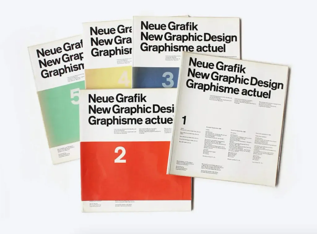
Characteristic features of modern design:
- Grid systems for organizing text and images.
- Readable sans-serif fonts, such as Helvetica, developed by Swiss designers.
- Simple, unprocessed photos ensure clear communication.
- Asymmetrical layouts maintain visual interest and balance.
Inspiring examples:
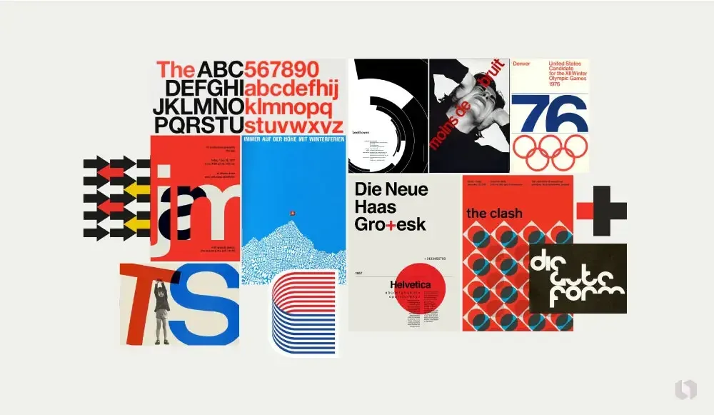
The Helvetica font: Max Miedinger and Eduard Hoffmann created Helvetica in 1957, and since then this neutral grotesque has virtually become synonymous with Swiss style. Many designers still use it today!
7. Psychedelic style
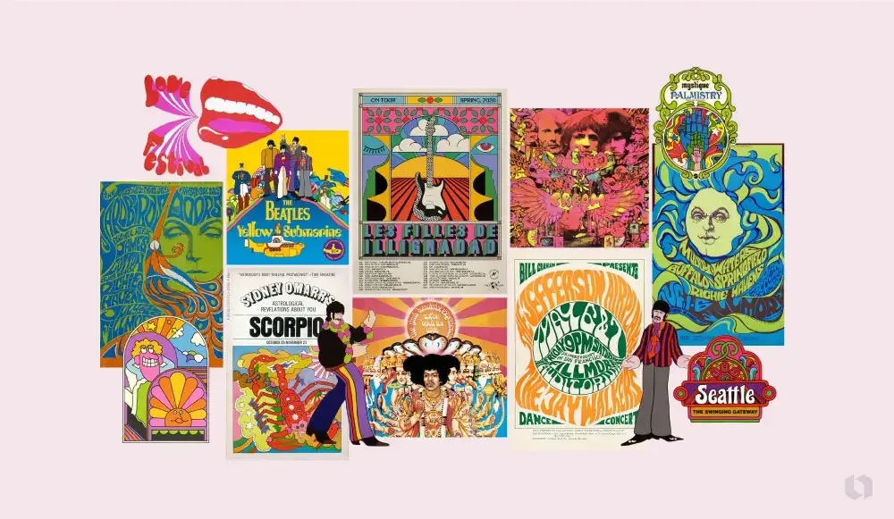
The basis of the psychedelic style is bright juicy colors, surreal visuals and amazing patterns. It is the result of the cultural shift of the late 1960s.
Psychedelic reflects the counterculture and music of that era, which was strongly influenced by the spread of illegal substances and the desire for for a deeper understanding of the self and the world around us.
This iconic poster for a series of Beethoven concerts is a vivid example of the Swiss style. Posters by the Swiss National Tourist Office: These Swiss-style posters convey information clearly and quickly. information to the audience.
Characteristic features of modern design:
- Bright, saturated colors that contrast sharply, making a strong impact on the viewer.
- Complex swirling patterns and abstract shapes that mimic hallucinations.
- Hand-drawn lettering: Unique, stylized and often distorted lettering makes the text a tool of artistic expression. expression.
- Surrealistic images, similar to dreams or collage elements, evoke a sense of altered consciousness.
Inspiring examples:
- The Yellow Submarine: The 1968 animated film and its promotional materials showcased vivid surreal landscapes and characters.
- These artists are known for their concert posters for bands such as The Grateful Dead and Jefferson Airplane.
- The album covers of “Axis: Bold as Love by Jimi Hendrix and Disraeli Gears by Cream are iconic examples of psychedelic graphics.
8. Postmodernism
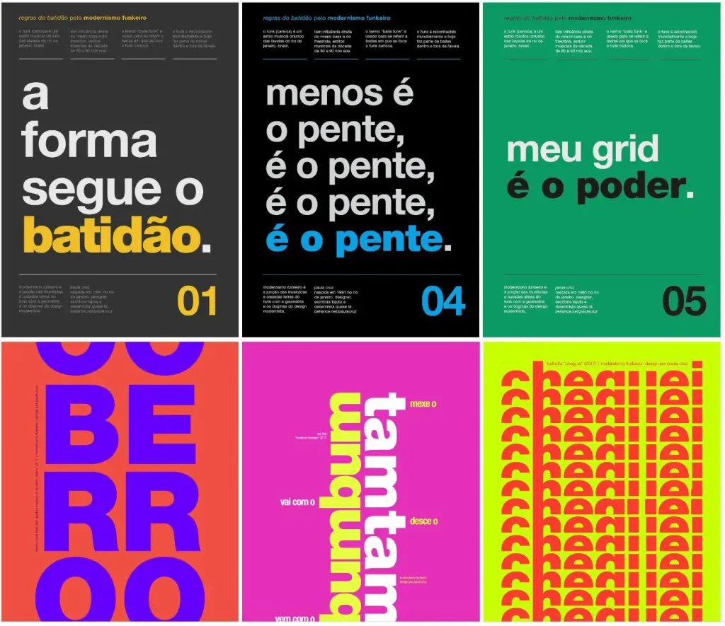
Most artistic movements begin as a rebellion against the status quo. And postmodernism is no exception. This movement (not a style, but a set of movements united by common ideas) was a response to the strict norms of modernism.
Postmodernism absorbed elements of different styles and sought to break down the barriers between “high” and “low” art.
This era is characterized by the rejection of minimalism and the acceptance of complexity, contradictions and diversity. Designers tired of modernist rules and norms, and they decided to use new technologies to unleash their creative to unleash their creative potential!
Characteristic features of modern design:
- Eclectic typography: Postmodern design often combines different font styles, sizes, and orientations and departs from the strict grids of modernism.
- Playfulness and irony: This type of design is characterized by humor and an element of surprise that challenges traditional approaches and the expectations of the audience.
- Parody: Different styles and historical images are combined to create works that parody existing works of art.
Inspiring examples:
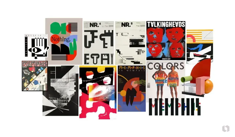
- The Memphis Group, founded in 1981 by Ettore Sottsass, is famous for its colorful home furnishings. Their playful, eclectic products challenged the conventions of design at the time.
- Wolfgang Weingart is the “father” of the New Wave or Swiss Punk printing house. He rejected traditional grids and and demonstrated a new graphic freedom.
- Tibor Kalman and his company M&Co: He used visual irony and photomontage to draw attention to social social issues. Examples of his work include the cover of the Talking Heads album Remain in Light and Colors magazine.
9.Brutalism :
Brutalism came to graphic design from architecture in the mid-20th century as a reaction to the purity and predictability of modernism.
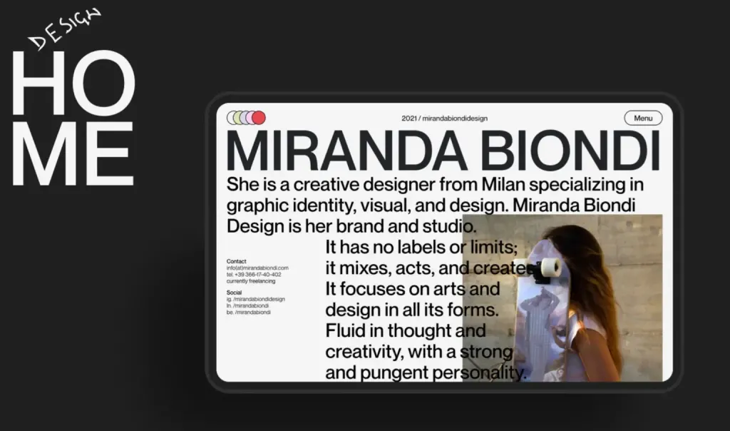
The brutalist style is characterized by sloppy typography, asymmetrical layout, monochrome or contrasting color combinations of colors. The space is often filled with overlapping graphic elements and photographs. Complete disregard for the rules!
It is not about harmony or ease of use. Brutalism challenges our perception and evokes a strong reaction. It is similar to psychedelics, but more grunge.
It’s a way to destroy a digital place by giving it a serious realism. Brutalism marked a move away from perfection towards a rough, raw appearance that challenges conventional notions of beauty.
Characteristic features of modern design:
- Monochromatic or contrasting color combinations, often black, white and gray combined with bright accents of color.
- Rough typography: Large, distorted fonts that draw attention. “Naked design: As in brutalist architecture, the “bones” of the design, such as the grid, are often left visible.
- Asymmetrical layout: A departure from the traditional balanced layout, preference is given to unpredictable and dynamic arrangement of elements.
Inspiring examples:
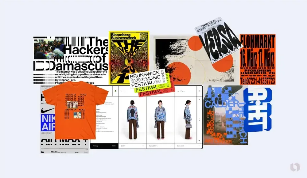
- Bloomberg Businessweek covers: Under the direction of creative director Richard Turley, the magazine’s covers have become an example of brutalism with massive fonts and bold designs.
- Kanye West’s merchandise for the album “Life of Pablo” is characterized by minimalist rough design, raw fonts and and images.
- Balenciaga’s website is an example of a brutalist approach: it is characterized by bold contrasts, minimalism and functionality.
10. Flat design
The emergence of flat design is associated with the proliferation of smartphones. Designers moved to a simpler and more universal aesthetic. As a result, websites loaded faster and became easier to use.
We prioritize usability, minimalism, and clarity, removing unnecessary details to focus on functionality.
This movement started to gain momentum in the 2010s, when large companies like Microsoft and Apple implemented flat design in their their operating systems. Today, we can often see this style in branding and logo design (just look at the at the redesigns of the last few years!)
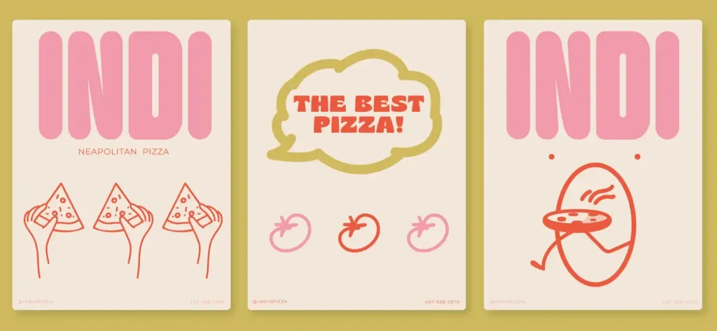

Characteristic features of modern design:
- Simplicity: Simple elements, typography, and flat colors.
- Functionality: All elements serve a clear purpose, increasing usability.
- Bright contrasting colors make the design visually appealing.
- Massive minimalist fonts increase readability.
- Grids and a variety of negative space help to create a balanced, cohesive design.
Inspiring examples:

Microsoft’s Windows 8 interface, made up of simple, colorful tiles, marks a shift from skeuomorphism to flat design. The emergence of this style was a turning point in the philosophy of digital design. Online platforms began to focus on on the unique appearance of the digital space rather than on imitating objects in the physical world.
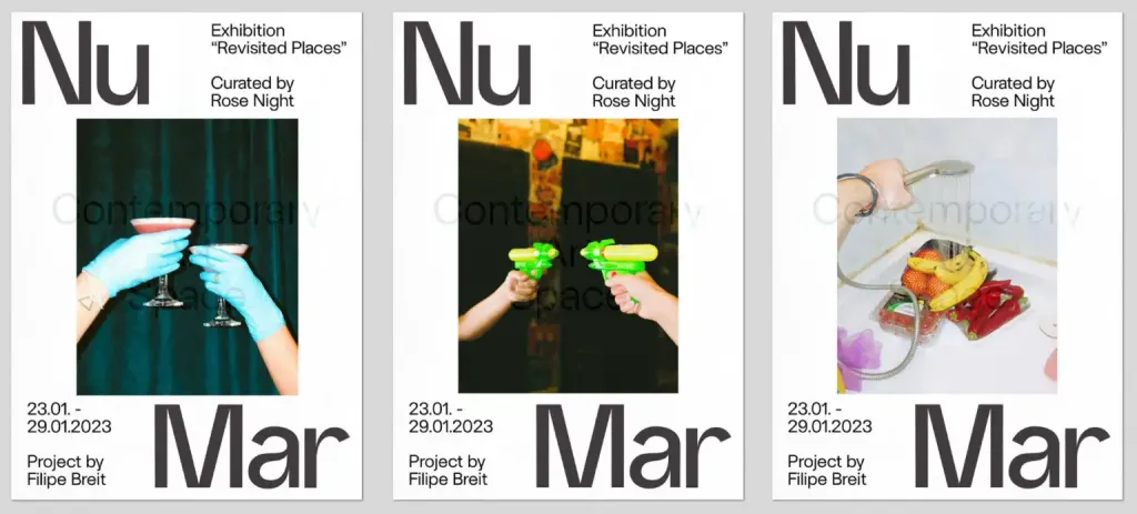
11. Modern graphic design
Modern styles are being formed right here and now. Everything around you is modern - the packaging of your favorite brands, event posters, logos!
- Apple’s iOS 7 introduced flat design to a wide audience. The company abandoned realistic icons in favor of more schematic, simplified icons.
- Google’s Material Design: Despite shadows and imitation of depth, Google’s visual language is largely based on the principles of flat design.
Modern design is determined by current trends, technologies, and cultural shifts. We are on the verge of an AI revolution, so now is the time to pay attention to how visual communication is changing.
Characteristic features of modern design:
- Large, often experimental typography helps to attract attention and make a statement.
- Bright, contrasting colors and unconventional color combinations help you stand out and evoke certain emotions.
- Combining digital and traditional techniques, such as digital graphics and hand-drawn elements, creates a a multifaceted visual experience.
- Sustainability and awareness: Design reflects the challenges of modern society.
Inspiring examples:
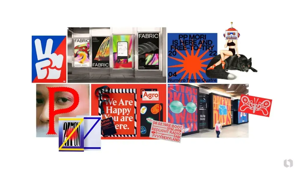
- Jessica Walsh’s work is characterized by a bold use of color and form, a combination of traditional and digital techniques, which allows her to push the boundaries of contemporary design.
- Pentagram graphics: The famous design studio creates immersive spaces with the help of trendy printing and interactive elements. elements.
- Logos and posters by Aaron Dreplin: The designer uses thick lines, bright colors, and simple shapes to create striking designs that resonate with a wide audience.s
Experiment with different styles
Graphic design is a dynamic field that reflects the changes taking place in society and forms a global visual language.
to choose the right style:
- Define the purpose of the brand: The design should align with the brand’s identity, audience, and core values.
- Research trends and look for inspirational references: For a design to remain relevant for a long time, it is necessary to find the right balance between modern fashion and classic approaches.
- Experiment with different styles to find the best solution.
This way you can create a design that not only makes your brand stand out from the crowd, but also reflects its values and resonates with your audience.
