Trendy color palette for 2024
Color is one of the most important aspects of design. And it’s not just about aesthetics, color is a tool that allows you to evoke certain emotions in the audience. Color trends reflect the mood prevailing in the world. Today we will analyze what shades there will be relevant in 2024. In this article, you will definitely find color solutions that will inspire you to create something new and original
If you’ve ever worn pink to cheer yourself up or black to feel confident, you know how powerful colors can be. can affect our emotions. Color trends work in a similar way - popular shades reflect moods that prevail in the world.

To identify the color trends of 2024, we spoke to freelance designers who work with thousands of small businesses every year and understand where the industry is headed. We found that companies prefer color combinations, c that feel strong, expressive and confident — a sign that brands are ready for serious technological and social changes
Some color trends, for example, spicy citrus and bright chewing gum, inspire faith in the best, the desire to stay cheerful and fearless. Others, such as digital noir and industrial twilight, create a darker and more gloomy setting the atmosphere
Luxurious neutral shades
To evoke emotions, colors do not necessarily have to be bright. Although such shades as white, eggshell, beige, oatmeal may seem old-fashioned and too restrained to you, this trend proves that a muted palette can look cool and confident.
Luxurious neutral colors combined with soft, cozy textures and minimal designs suit brands that want to demonstrate ultra-modern sophistication and casual elegance. They have always helped us create a clean, simple design in a chaotic world of high technology. But in 2024, neutral colors will be especially chic, elevated and stylish, not bohemian or natural.
This trend is associated with the revival of minimalism in areas such as fashion, beauty and interior design, so it will be especially relevant for brands in these industries.
In 2023, quiet luxury and clean girl aesthetics dominated TikTok: influencers sought to create “expensive” images using neutral tones and restrained style. And regarding home decor Architectural Digest called this trend white chocolate minimalism.
Bright chewing gum
The same Millenial pink (“millennial pink”), but with a pronounced character. This trend has its roots in “kitsch”, which drew inspiration from the playful pastels of the Y2K era. The hype around Barbie prompted brands to go even further, so in in the new year, the palette will become much brighter and richer.
“In 2023, Barbie fever took over the world, and it’s still not over. The color of the chewing gum looks playful and charismatic, which makes it more versatile than baby pink or millennial pink. Bright shade great for digital applications, which is perhaps why many fintech companies are turning to it as a sign protest against the “suffocating” corporate world of traditional banks.” Imogen Hill, Assistant Creative Director, 99designs by Vista.
As the name suggests, the shade of chewing gum came into the design straight from the candy store. Remember sugar pinks, blues and purples combined with splashes of acid yellow or green! Cheerful, youthful and charismatic, this trend can fill your business with joyful optimism during difficult times.
Digital noir
If the computer monitor were a person and choosing colors for his new wardrobe, he would stop at this option - gloomy, melancholic shades of gray from pale smoky to charcoal. Digital noir reflects our increasingly difficult times relationship with technological progress.

It looks austere, without futuristic whimsy. With the help of such a color palette, you can present your business strong and durable, that stone wall on which clients can rely in a difficult moment.
Spicy citrus fruits
Do you want to add a raisin to the design? Bright spicy shades of green and yellow can give the brand a fresh, playful look appearance (which is why they are so popular among soft drink manufacturers, for example, Fanta and 7Up used citrus shades in their 2023 rebrands). A tangy, eye-catching citrus palette that seems to tell customers, that we are excited about our product and can’t wait to show it to you.
Spicy citrus tones appear where we do not expect to meet them - in areas such as finance, sales or industry. In combination with black and other neutral colors, shades of lime and lemon give traditional products a bold and fresh look.
Ocean waves
Tired of the problems of modern life? This color palette will fill you with a somber calm and open up the infinite before you the possibilities of the deep blue ocean.

The pulsating blue is reminiscent of waves rolling onto the shore, complemented by the rich orange and green colors of coral reefs. But this palette isn’t inspired by a carefree beach vacation. Oceanic waves are a darker and more mysterious trend. He is wonderful will work for brands that want their customers to feel fully immersed in an exciting, seductive, luxurious world and constantly asked themselves… what is hiding under the water?
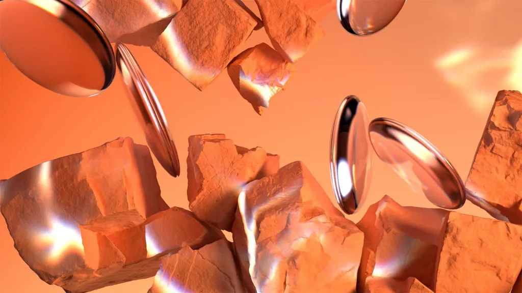
Industrial twilight
Imagine the orange glare of a street lamp, the earthy red color of burnt brick, the metallic sheen of steel beams This exciting color trend combines dark, blood red and orange shades with black, silver and yellow. He contrasts strict urban aesthetics with bright colors.

In the face of growing dependence on AI tools and technologies, the industrial twilight brings a fiery, pronounced human energy into a design that might otherwise appear austere and sterile. This palette is like pulsating blood in the veins of your branding can make the image of the company more down-to-earth, emotional and soulful.
Mother of pearl
Not to be confused with the aggressive metallics that were popular last year! Mother-of-pearl is blue, purple, green shades, they shimmer and shine. You could meet echoes of this trend in fashion, for example, milk manicure. It is also connected with the “mysticism of millennials” (love of all things non-scientific - crystals, astrology, tarot) that arose against the background of the pandemic. Which the mineral of the same name, the mother-of-pearl trend gives the design a dreamy, ethereal, expensive touch. What Brands Need which aim to look sophisticated but not too minimalistic.
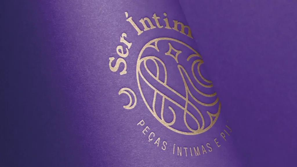
Royal shades
If anyone knows how to stand out from the crowd, it’s kings and queens. In 2024, when brands and designers crave the bold of self-expression and experimentation, some inspired by traditional royal hues—rich purple, bold red, royal blue and gold.
Purple has been associated with royalty since ancient times, when rich Phoenicians acquired a rich plum color from the secretion of sea snails. Versace revived it for its Spring Summer 2023 collection at Milan Fashion Week - Italian the fashion house used rich shades of purple and indigo to give a glamorous look to gothic outfits.
This is an excellent color palette for brands that want their products to look luxurious, desirable and even exclusive: as if giving their customers the opportunity to feel like royalty.
Apricot shades
Rounding out our list is apricot, a fresh palette of orange shades that symbolize prosperity and vitality. Experts WGSN called this color Apricot Crush and described it as “a vitamin-enriched shade that gives you a healthy glow and well-being”. It is a positive, optimistic color for brands that want to instill strength and confidence in us, to help to cope with the fear of the unknown.
And if we touched on the topic of trendy peach-orange shades, it would be unfair not to mention the recently announced Pantone Color of the Year 2024, Peach Fuzz.
Like other apricot shades, this peach color “reflects our natural desire for closeness and unity with other people,” radiates positivity and gives us hope for a peaceful, happy future. Although Peach Fuzz and apricot shades are neighbors in color circles, each of them has its own characteristics.
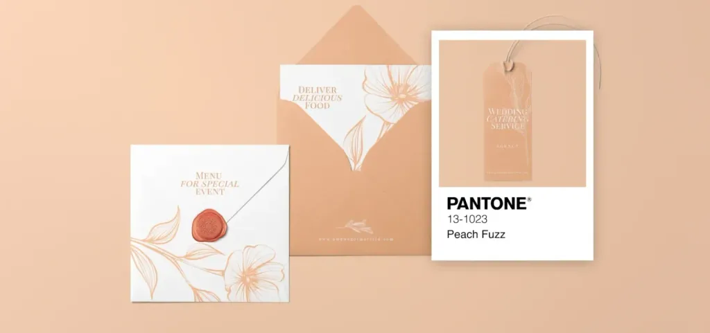
In a way, Peach Fuzz is a muted version of apricot. It is a little lighter, much softer and not so striking. It is gentle, pleasant and able to make any space cozier. If apricot shades are the soul of the party, then Peach Fuzz is a relaxing Sunday morning, both fresh in their own way.
So, 2024 will be the year of finding the right shades that will help brands confidently navigate the changing world. Whatever you choose - a bright citrus logo or apricot packaging - be bold and free, don’t be afraid to express yourself your individuality.