A comprehensive overview of design trends for 2024
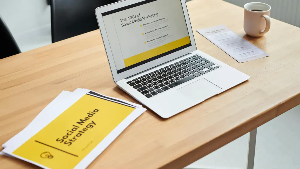
In this article, we have collected the key design trends for 2024 and divided them into 8 themes that will be in focus this year.
As a result, we received the following directions: “Nostalgia”, “Multidimensionality instead of minimalism”, “Printing evolution”, “Kinetic Typography”, “Human at the Center of Everything”, “Social Design” and “Authenticity instead of Artificial Intelligence”.
We will tell you more about each of them later!
Nostalgia
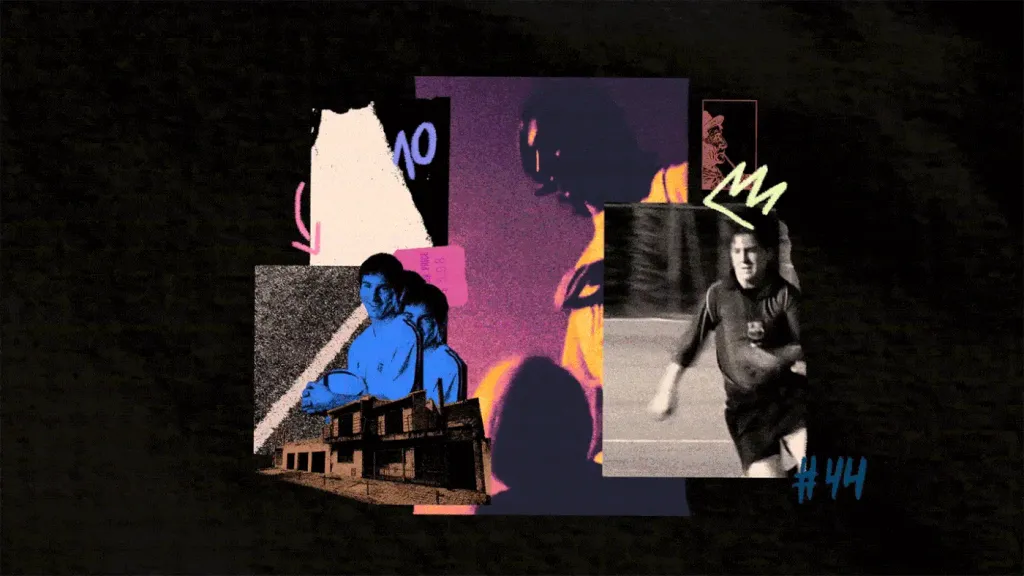
This year, in all trend reports, there is a yearning for the past and the return of the “good old days”. In particular, it is related with the desire to hide from the pessimistic reality and find refuge in familiar things. In other words, you can say that nostalgia will become one of the key focuses in creativity and design in 2024.
This trend includes, in particular, modern interpretations of vintage styles, as well as hyperrealistic visualizations past periods. For example, according to Depositphotos, one of the directions of the trend will be #oldmoney aesthetics (“old money”), which provides the audience with reliable support in old, time-tested ideas.
To implement this trend, the team advises to use natural dull colors and muted logos, integrate into communication fonts in the style of the 20th century, as well as focusing on objects with traces of time and traditional ornaments.
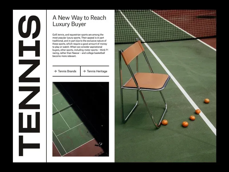
Creative Boom is sure that the nostalgia trend will not miss the “doll” spirit of America of the 1950s. Cadillacs, pink Barbie, the world of Wes Anderson, Palm Springs and cotton candy color palettes, all these visual themes awaken in the audience positive emotions and associations, and therefore will be relevant this year.
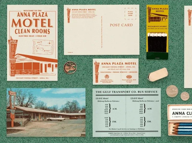
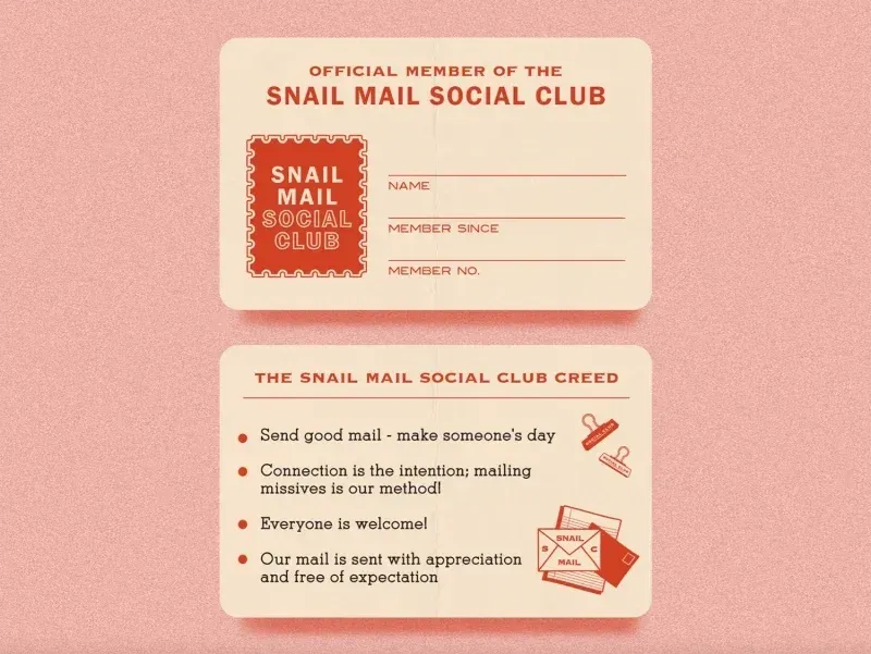
In typography, we are also expecting the return of retro fonts, but already in a reinterpreted modern interpretation.
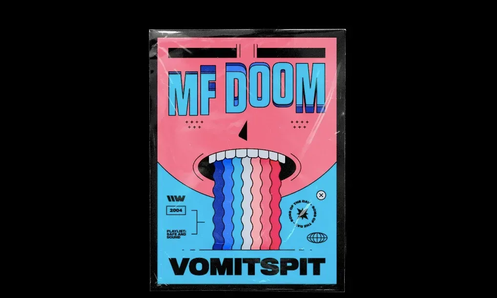
In addition, in 2024, a wave of growing interest in street culture, in particular, the period of the 70s and 90s, is predicted.
How can this be used in practice?
For example, by integrating elements of urban aesthetics in the campaign, such as graffiti, solid fill and highlighted in bold outline of cartoon characters, as well as using post-processing effects that simulate VHS noise or grainy printing, typical of the design of the late 70s.
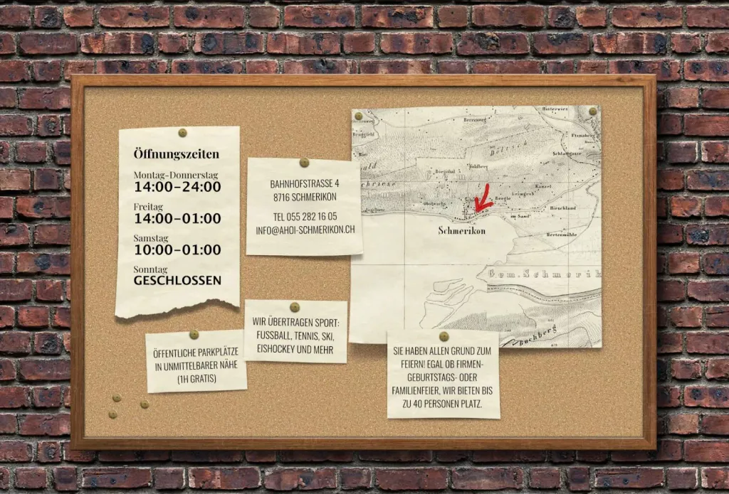
But in web design, the nostalgia trend found an interesting embodiment in the skeuomorphism effect.
Webflow predicts that the trend of rendering elements that mimic their real-world counterparts will return to web design in 2024. After all, users are increasingly attracted to designs that remind of the pre-digital world.
Therefore, there will be more disks, switches and paper notes in the design of websites.
Multidimensionality instead of minimalism
With the advent of technology like Meta Quest 3 and Apple’s Vision Pro, the creative industries will continue to grow multidimensionality and interesting combinations of different techniques.
For example, a number of experts predict a wave of popularity of 3D fonts, so in 2024 it will not be superfluous for designers to master 3D tools. And Adobe in its reports emphasizes the combination of various formats of 2D and 3D content with AR and VR technologies.
As for graphic design, these trends can be realized with the help of layering, creating collages, as well as experimenting with different styles and concepts.
The trend will find its embodiment in web design. According to Webflow, in 2024, minimalism will fade into the background. At the same time, websites will have more complex compositions — with animations, textures, patterns and saturated colors.
Printing evolution
Most experts predict that text communication will become the queen of design in 2024. Consumers trust clear and transparent word meanings, which inspires brands to experiment with this format. And this means that this year the typography and typefaces will increasingly become a key focus in design.
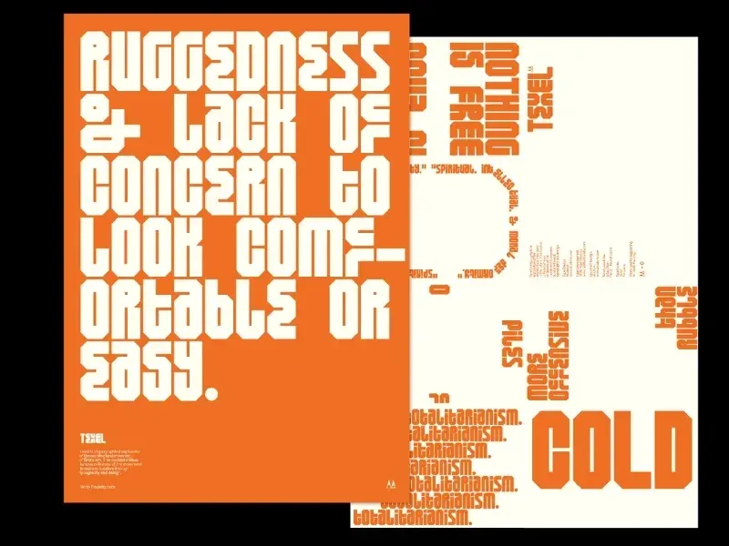
Depositphotos advises you to pay attention to the following possible embodiments of the trend:
- use of large vintage letters and handwritten fonts to visually highlight key messages;
- a combination of contrasting fonts (for example, legible grotesques with pixel ones) with the aim of intriguing the audience;
- shocking with the help of animated fonts (so as not to go unnoticed).
In web design in 2024, we will obviously see more websites where fonts will be the dominant visual element the inscription is also non-standard. For example, the trend of combining fonts of different styles is already actively spreading, and experiments with text and mixed media.
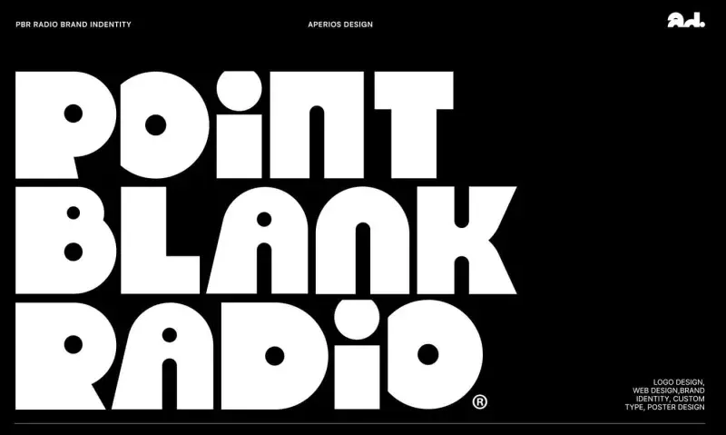
Here a logical question arises: which fonts should be preferred in 2024?
If there is one major typographic trend of the last ten years, it is the rejection of serifs. As Mark Richardson explains, designer and founder of Canadian design studio Superfried:
“In the digital world we see on the small screen, sans-serif fonts are preferred for wordmarks. And in order not to get lost against the background of such font inscriptions, experts advise experimenting with headsets and making their more whimsical, contrasting and dynamic.”
Before experimenting with typography, it is useful to understand the structure of fonts and their properties. For this our course “Typography in graphic design” will come in handy, within which you can learn to work effectively with text, harmoniously select fonts and compose text compositions.
Kinetic typography
Dynamism smoothly leads us to the next trend, which is found in almost every forecast for 2024 — kinetic typography In order to have an increasingly unique and authentic look, brands will increasingly use dynamics in their designs and animation. In particular, this also applies to font inscriptions, which will become more mobile, or one might even say “more energetic”.
We advise you to pay attention to development in the direction of moush design and practice various tools for 3D and animation. For example, you can start with our “Working with Cinema 4D” and “Working with AfterEffects” courses.
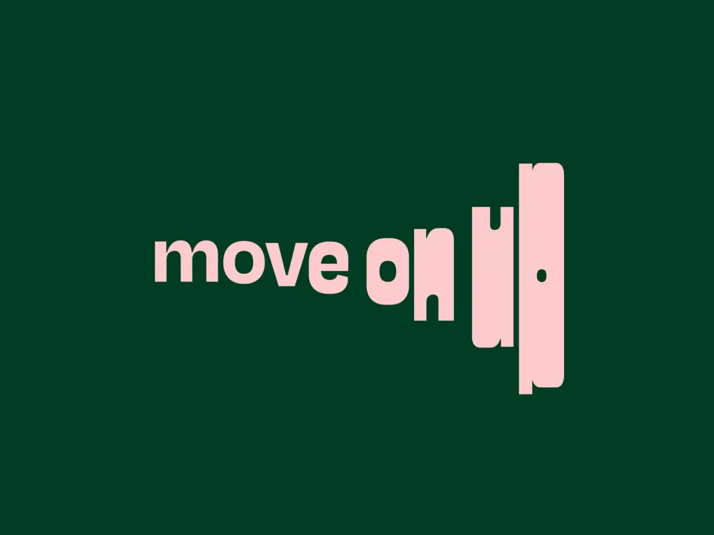
More dynamics and animation will also appear in the font compositions of websites. This will help make the user experience more interactive, and the website pages are not only informative, but also attractive.
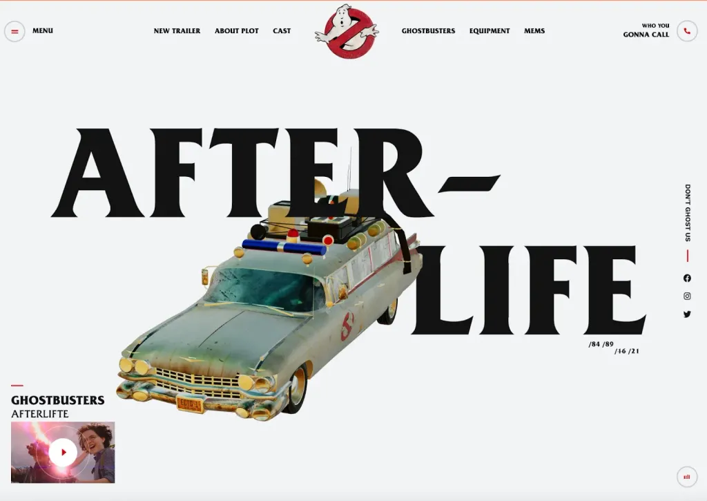
For example, Webflow predicts that its second breath will receive the parallax effect, a technique in which background content moves from at a different speed than the front one, creating the illusion of depth and a more dynamic visual experience. It is expected that in combination with animation, video or gif images, it is able to provide a deeper level of interaction with the website.
Man is at the center of everything
The next stop on our trend journey is human-centered design. But in this context it is more about meanings, rather than functionality.
Nowadays, many people are in constant struggle with stress, negativity and anxiety. And taking care of mental health comes to the fore. This means that in visual communications, the audience seeks comfort and peace.
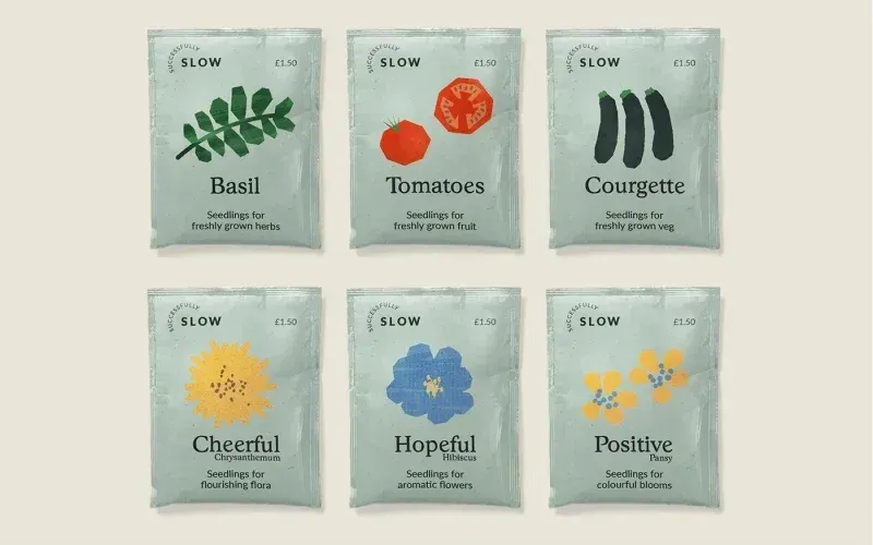
Calming and smooth visuals, images that have a positive effect on mental health, soft rounded fonts, warm natural shades, natural materials - all these are tools with which this trend can be put into practice.
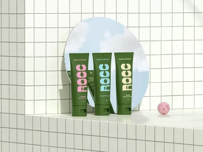
Given this trend, experts advise web designers to turn to the implementation of micro-interactions — small interactive website elements that respond to user actions, such as hovering over a button or clicking an icon. These interactions often minor, but can add significant engagement and intuitiveness to a user experience.
Social design
Design is always an embodiment of what is happening in society and culture. Therefore, some social trends will have a direct impact on our industry this year.
One of them is personality over gender. Values will replace gender as a target audience characteristic for brands, and artists will create works focusing on the uniqueness of their models, psychological portraits and equality.
To implement the trend in practice, Depositphotos recommends using photos of people of different sexes in the same poses and clothes, who show the same emotions on camera, and to prefer gender-neutral colors.
Environmental responsibility, the significance of which is becoming higher every year, does not bypass this trend.

What exactly does it mean for graphic design?
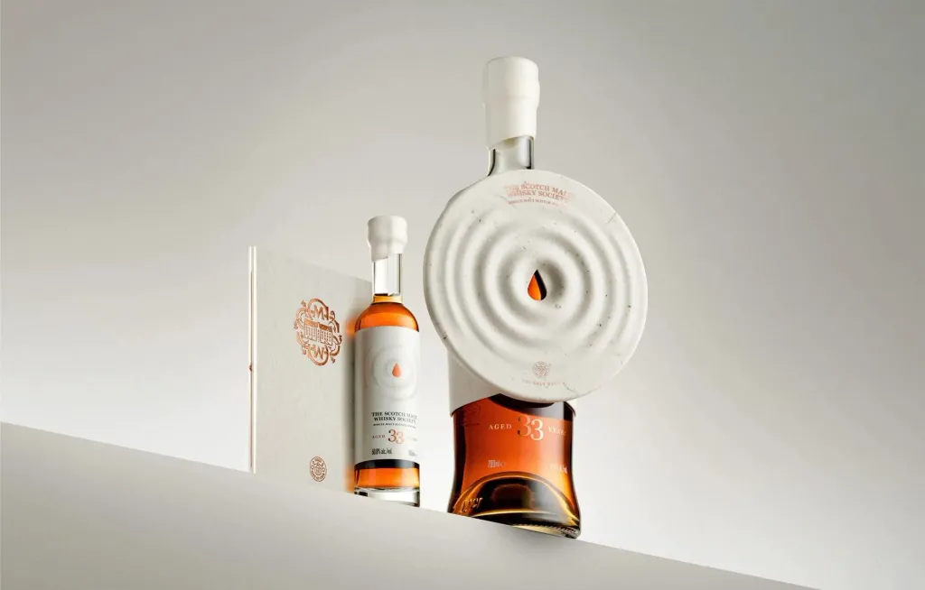
First of all, experiments with packaging and materials used for it. Many brands prefer edibles packaging or even completely abandon it in their products. But it all boils down to what the designers will have to do use more creativity to find ways to combine sustainability and visible branding.
Authenticity instead of artificial intelligence
We deliberately left artificial intelligence at the end of this article, because nowadays few people will be surprised by the advice to integrate tools generative art into the work process.
However, not everything is so simple here. On the one hand, artificial intelligence will indeed continue to change the industry in the coming year. In particular, approaches to the design process. It will come in handy to optimize routine tasks, to create a more personalized one user experience or choosing harmonious color palettes.
By the way, if you have had the opportunity to work with neural networks, join the students of our course “Working with Firely”, which will help to figure out how to use the artificial effect as effectively as possible to speed up work.
But to the question of whether generative art will find a warm response in the audience in 2024, the answer is rather negative.
More and more people are worried about the consequences of rapid technological progress and refuse to accept machine creations. On the contrary, people will seek to see visually authentic, in some sense even naive works that look as if they were definitely created by man.
Summary
After all, no trend is a clear rule that should limit your efforts and put them within certain limits. It is rather another way to better understand your audience and assess global industry trends.
Use trends as an additional source of inspiration and a foundation from which to develop creativity and creativity experiment, but always stick to your creative vision and identity.
