Typography in mobile applications

Focus on readability
When choosing a font for a mobile app, the most important aspect is readability. This is a key property that affects content perception, accessibility, ease of navigation, and reduction of errors.
Readability is critical not only for the UX of all digital products, but especially for mobile apps, where limited space and reduced attention spans make quick and clear communication vital to success.
For example, when designing the food delivery app NOM NOM, I focused on thoughtful typography and legible fonts. My goal was to maximize the readability of navigation elements such as menu items, filters and buttons so that users can easily navigate the app and place orders without any problems.
When choosing a font for a mobile application, consider the following factors:
Notched vs. notched
Serif and sans-serif fonts have their own characteristics that can affect the aesthetics and readability of the interface.
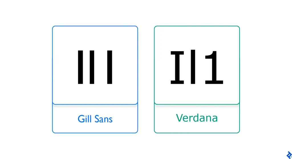
Sans serif fonts help to distinguish certain characters more clearly, such as the uppercase letter “I” and lowercase “l”, and the number “1”. In the past, these fonts were mostly associated with printed materials, but with the development of technology, they have become popular in digital products, including mobile applications.
For example, The New York Times uses Georgia, an elegant and legible serif font, both on its website and in the app. Its glyphs with thick strokes, open apertures, and tall lowercase letters make it easy to read even in small sizes. even at a small size.
However, not all sans serif fonts are suitable for mobile apps. Beware of overly stylized fonts, such as Old English, with their shadows, outlines, and decorative elements, as they can be difficult to read on small screens. small screens.
Sans-serif fonts, on the other hand, are usually well suited for small spaces. They are often used in mobile applications because of their simple and clean design, which ensures good readability on small screens and low-resolution screens. and low-resolution screens. For example, Roboto, a modern geometric font developed by Google for the Android mobile operating system, is a great example of such a font.
Font pairs
Creating a successful font pair can be a challenge: the typefaces must complement each other and look harmonious. This is especially important in mobile applications, where you need to be especially careful when choosing fonts.
Since users can be on the move or perform several tasks at once, it is important that information is quickly and easily understood. In addition, the number of fonts affects page loading speed, which is critical for for mobile users who don’t like to wait.
Toptal designer Carly Chang recommends creating a typographic system that defines the font, style, size, line spacing, and other parameters for different types of text. spacing, and other parameters for different types of text in your app, such as headings, body text, captions, menus, and buttons. If you’re working with a well-known brand, they may already have a style guide to follow.
If you decide to use a single font for all text, try playing with its outlines, styles, and sizes, to add contrast and create a visual hierarchy. Medium is usually optimal for reading, while Bold is effective for emphasizing and highlighting key parts of the text that you want to draw the audience’s attention to.
Imposter letters
To ensure high readability, avoid fonts with “imposter letters” - characters that look very similar and can cause confusion. For example, a zero can be confused with a capital O, and a lowercase l can be mistaken for a capital I or the number 1, especially on small screens.

Consider the clickability of the text
The correct font size is important not only for creating a harmonious visual experience, but also for ensuring readability and clickability of text content on small screens. When designing a typography for a mobile app, you need to find balance: the text should be large enough to easily click on links or buttons, but not so large to take up the entire screen or require excessive scrolling.
In general, the minimum font size for body text should be 16px. It is recommended to make headings about 1.3 times larger than the main text. Another approach is to use the golden ratio, according to which headings should be 1.618 times times larger than the body text.

Designers can also take advantage of ready-made typography systems with predefined properties and styles. For example, the online tool Typescale offers different ratios for creating a font hierarchy. You can immediately see how the final result will look, including on mobile devices.
Build a clear hierarchy
Text size, style, color, image, case, and contrast help users quickly understand which elements are most important. are the most important. A well-built hierarchy gives meaning and context to each piece of content - headings, subheadings and body text.
Toptal designer Brian Carter recommends using grids and guides to align elements. This will help to make the typography proportional and ensure that the indents are consistent.
Line height for body text
Correctly setting up tracking, kerning, and line height is key to readability, especially on small screens where space is limited. is very limited. The optimal line height for body text on mobile devices should be 160% of the font size. This adds more “air” to the content and reduces eye strain.
Line height for headers
Headings should stand out from the body text. One way to achieve this is to leave enough space around the the heading and reduce the line height if the heading spans multiple lines. This will help to visually separate the heading from the rest of the text.
In general, the line height for headings should be 1.2 times the font size, and for subheadings, 1.4 times the font size. If the heading is in capital letters, the line spacing should be equal to or 1.2 times the width of the of the vertical strokes of the letters.

Text-brow
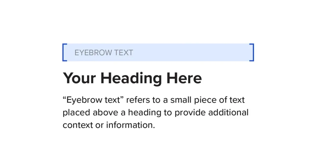
An eyebrow text is an element that is placed above a headline and helps draw additional attention to it. Usually this text indicates the category of content and helps users navigate the interface faster. In mobile apps the eyebrow text plays an important role in giving readers an instant idea of what to expect on the page.

Make typography accessible
Your program should be accessible to all users, including people with visual impairments and dyslexia.
First, it is important to remember that long lines of text can be difficult for visually impaired users to read. Although this problem is not so critical on mobile devices, it is recommended to limit the length of the line on desktop computers to 80 characters.
Second, text contrast is a key aspect of accessibility. Low contrast can make it difficult to read. Adding a dark mode will help reduce eye strain. You should also provide the ability to change the font size in the app, so that users can customize it to suit their needs.
Don’t forget about users of screen readers - special programs that convert text and other screen elements into into synthesized speech or Braille. These programs may have difficulty recognizing letters that are too close together or overlap. close together or overlapping. Very thin fonts can also cause problems.
Jacinta Oakley, a UX designer and consultant at Vision Australia, recommended using humanistic grotesques such as Calibri, Verdana, or Tahoma. The high height of lowercase letters, open apertures and unique glyph shapes make these fonts an ideal choice for screen readers. Another font with similar characteristics is Proxima Nova, which was even included to the top ten best fonts for mobile applications.
Always test your typography
Testing a printing house is an important step that allows you not only to detect errors but also to make sure that the chosen fonts, sizes and styles increase usability. Tools such as Font Tester, Fonts Ninja, and Typetester allow you to evaluate readability and legibility of text, while UserZoom, UserTesting, and Optimizely help you conduct surveys and other surveys to collect quantitative and qualitative data.
Testers go through various scenarios to identify the flaws in your design. For example, they can point out which text elements look too small and which ones are too large. The task of the design team is to take into account all the comments and make the necessary adjustments.
Conclusion
Mobile printing is constantly changing along with trends and audience preferences. To stay up to date with the latest news, subscribe to industry leaders, join design communities, and read useful articles.
Good typography goes beyond basic guidelines. It is important to understand your users to create a comfortable environment, in which they can interact with your brand or product.
