20 ways to design a background

A background is a basic element of any website or application. It sets the mood and helps to perceive the content correctly. To design it, can you make it monochromatic or gradient, add shapes, textures, a blurry photo, or a creative illustration? Remember that in addition to being attractive, the background should be relevant and the content should be updated regularly.
In this selection, you’ll find 20 great options for background design.
Frosted glass effectv
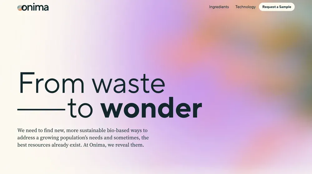
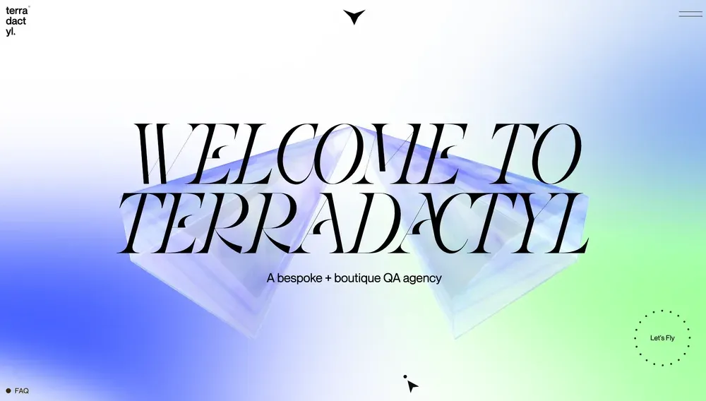
At first glance, this effect may seem too simple, but it has many advantages. It not only adds depth to your design, but also makes it much easier to create a contrast between the background and text. Frosted glass imitation goes well with both images as well as with a gradient background. The latter option looks more delicate and aesthetically pleasing.
Split background
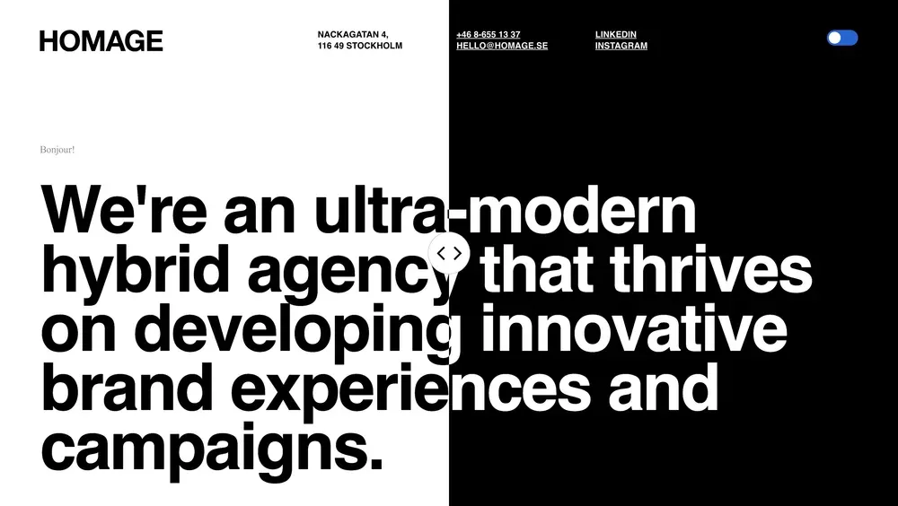
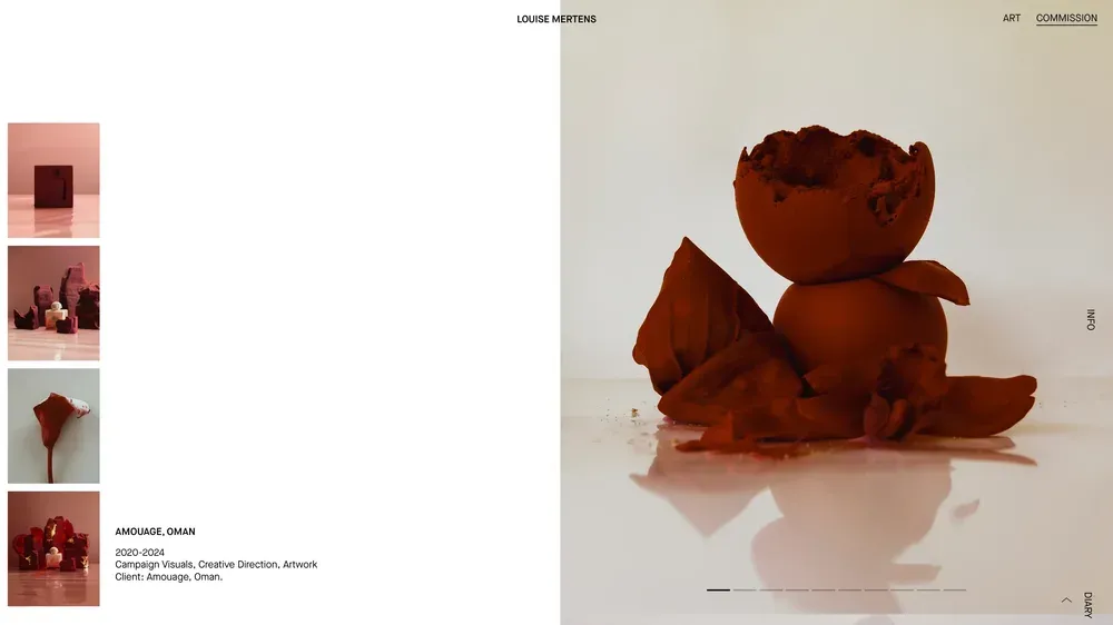
Another interesting option is to divide the background into several sections. However, it’s important not to just place two images or colors next to each other. You need to correctly distribute the visual weight to achieve a harmonious balance.
This approach gives room for experimentation. For example, the creative agency Homage (the first example) divided the screen with the help of interactive slider, where the user can change the ratio of columns by moving the slider. This is an original solution, that increases the level of engagement!
Funny illustrations
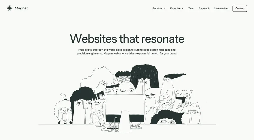
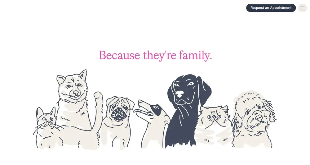
One of the most reliable ways to create a memorable and emotional design is to add fun illustrations to the interface. Today, hand-drawn images are common on many websites, although they can sometimes seem chaotic. When used correctly, illustrations give a brand personality.
Illustrations are a powerful visual communication tool. They can be used to convey important messages and make the design more expressive. They should not only be creative and understandable for your audience, but also harmoniously fit into the overall concept of the site, complementing its theme.
Neon glow
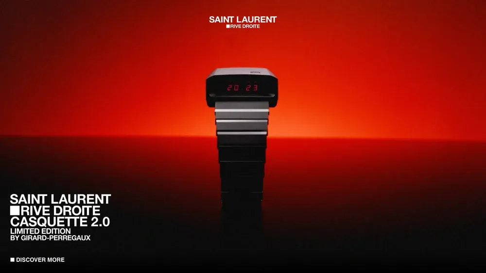
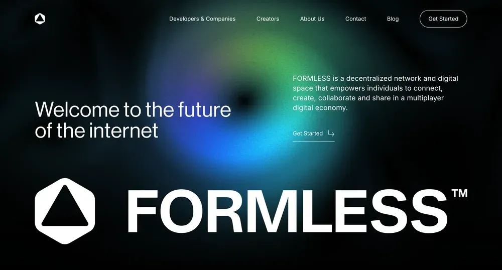
The neon glow effect always attracts attention. It looks especially impressive on dark interfaces, creating an atmosphere of mystery and of mystery and allure. Soft reflections add depth to the design, providing a clear contrast between the content and the background.
Neon glow is most often used on technology-related websites. It is also great for landing pages, promotional materials, and posters, adding modernity and dynamism to them.
Grainy textures
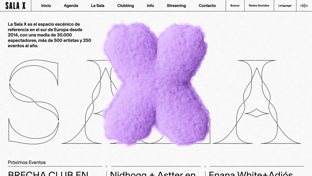
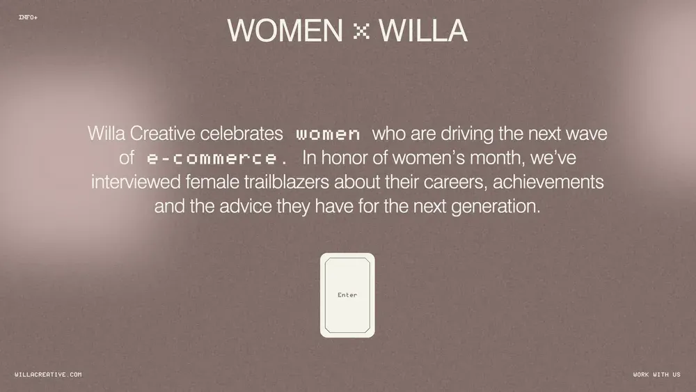
Backgrounds with grainy textures add a sense of “tactility” to the design. They make interfaces look more natural, rough and raw. This effect can be used to create both digital and printed works in retro style that evoke nostalgic emotions in the audience. It’s a great way to add character and uniqueness to projects.
3D illustrations
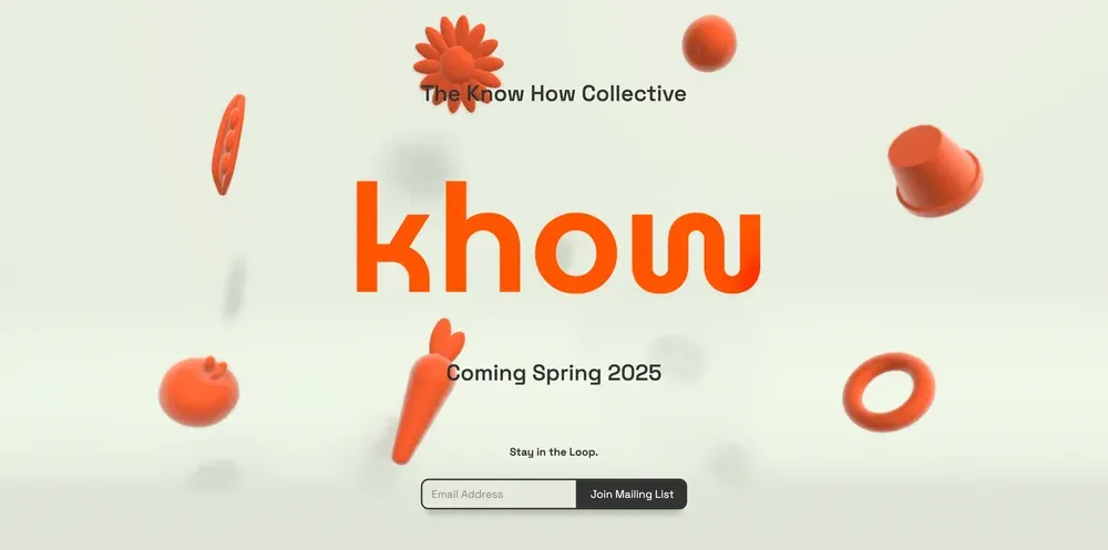
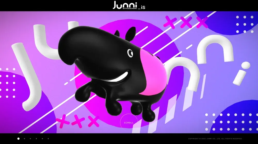
Three-dimensional elements have become one of the main trends this year. 3D illustrations look attractive and exciting, adding depth and dynamics to your design. Choose elements for the background that are in harmony with your content: it can be an elaborate scene or individual 3D icons floating on the screen.
Create your own illustrations or use ready-made sets. Add animations to make your design even more expressive and and memorable.
Pastel gradients
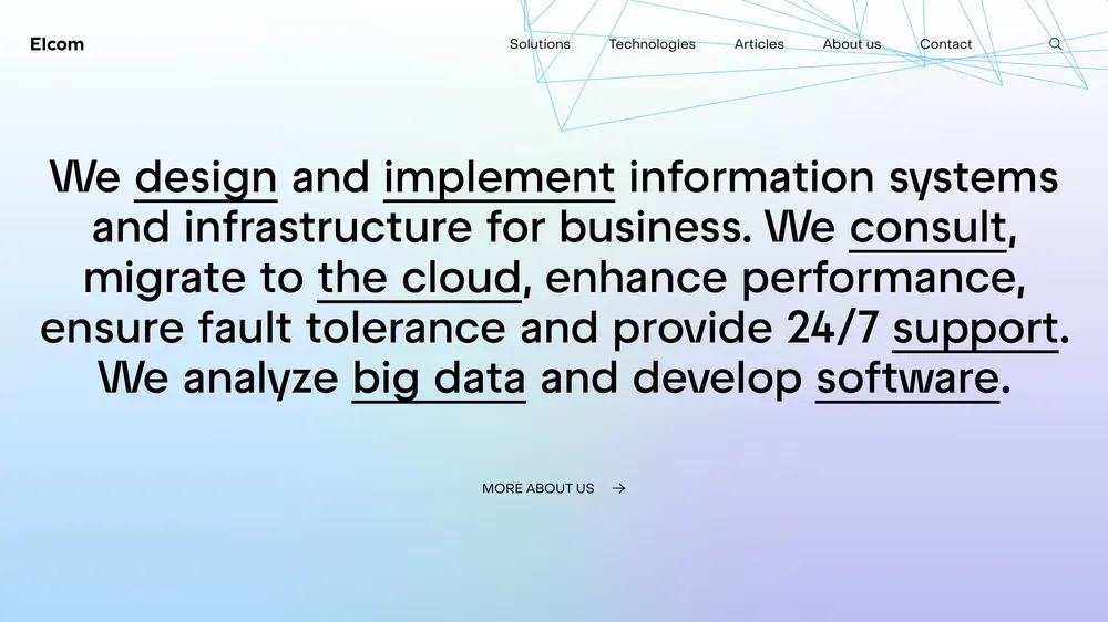
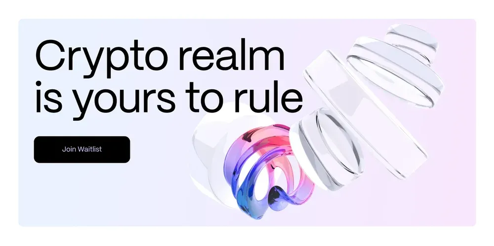
The pastel gradient background creates a gentle, soft, and delicate atmosphere. It adds depth to the interface and makes the visual visual style more effective. This background is versatile - it can be combined with almost any type of content, which makes it easy and quickly update or refresh the visual image of a brand.
Videophone
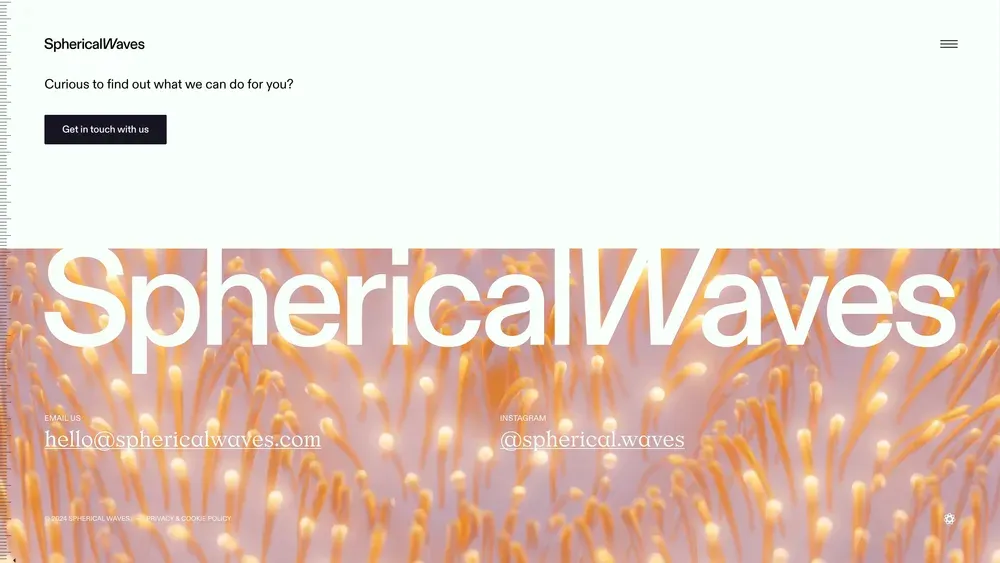
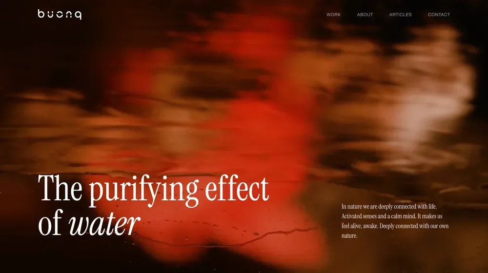
Background videos are becoming increasingly popular. They usually play a decorative rather than a meaningful role. Motion helps to keep the audience’s attention longer. A stylish solution that makes a significant contribution to the aesthetics of your digital product.
Linear geometry
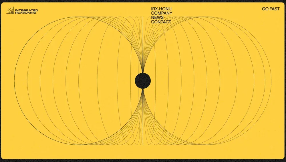
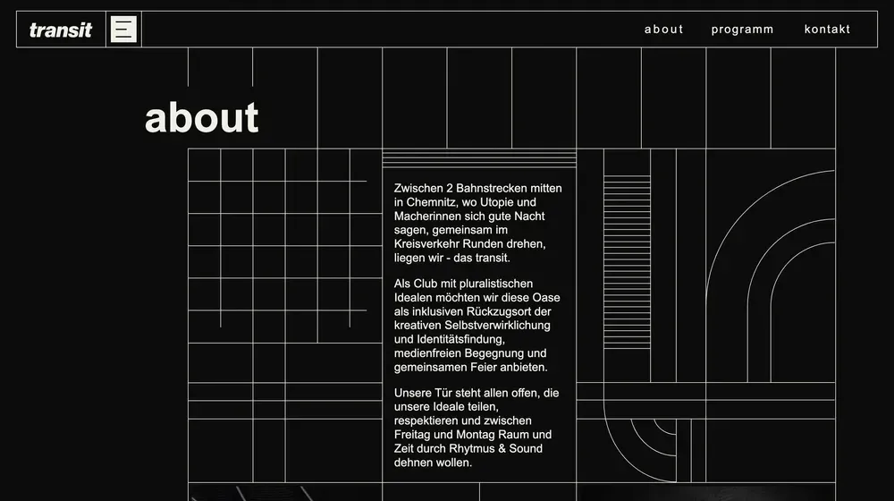
Geometric shapes can be a great addition to your design.
Delicate, thin lines attract users’ attention without distracting them from the main content. You can consistently use geometric motifs in different sections to make your website look coherent and harmonious.
Don’t be afraid to experiment: flip shapes, change their colors, transparency, add animations to add more dynamics and uniqueness!
Multilayer backgrounds

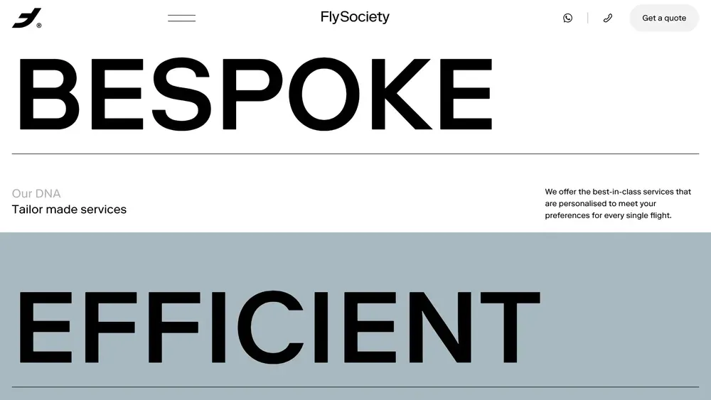
We’re talking about backgrounds that run over each other when you scroll. They can be either images or plain rectangles. They serve as the basis on which all content is placed. If such backgrounds are chosen incorrectly, they can overload the design and reduce the ease of interaction.
Choose images that are not too detailed and harmoniously fit into the color palette of the site. This will help you create a more pleasant and balanced visual experience for users.
Three-dimensional scenes
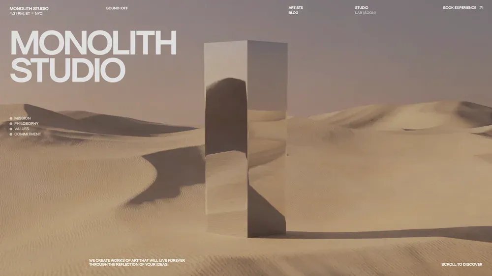
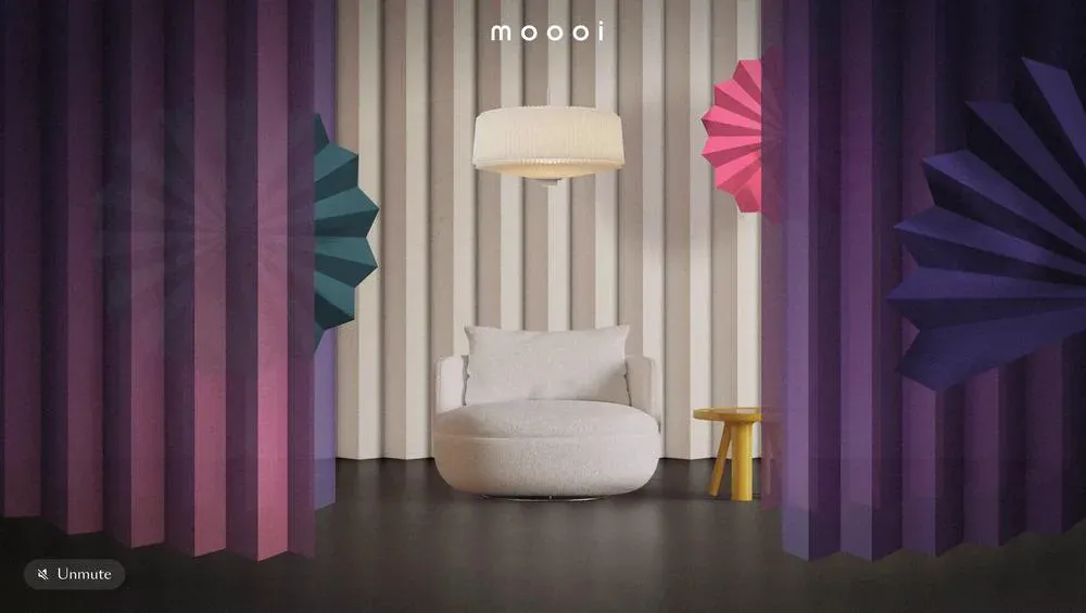
Three-dimensional backgrounds appeal to users because they look and feel real. People can literally immerse themselves into the design and become a part of what they see on the screen!
We have already talked about individual 3D elements, but here we are talking about full-fledged three-dimensional spaces that include realistic textures and animation. These are believable worlds that give the audience unforgettable emotions.
Layering elements
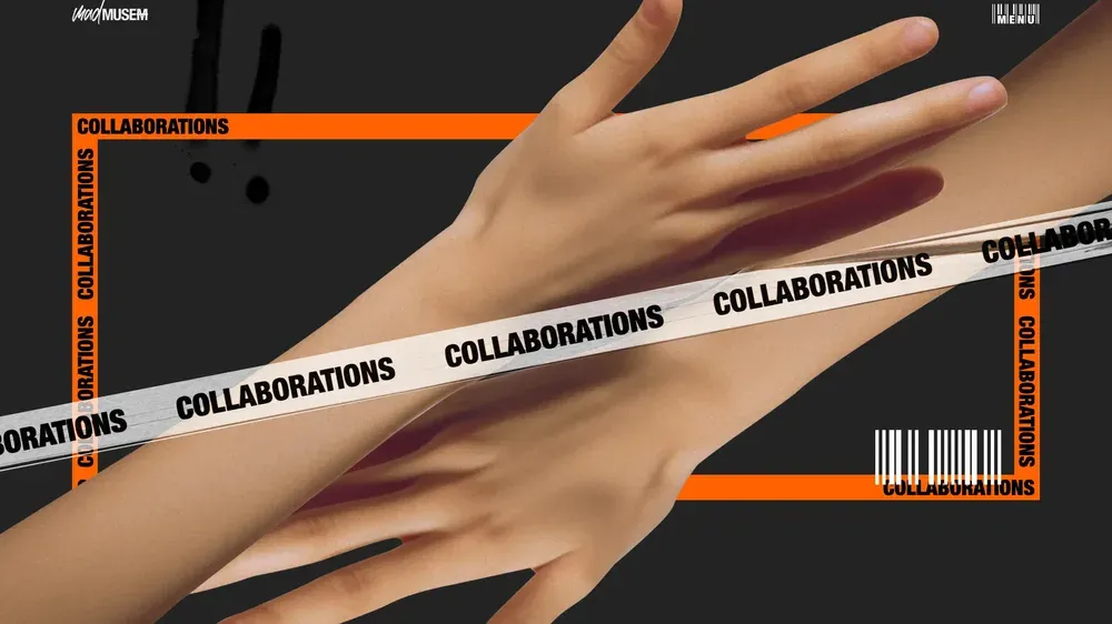
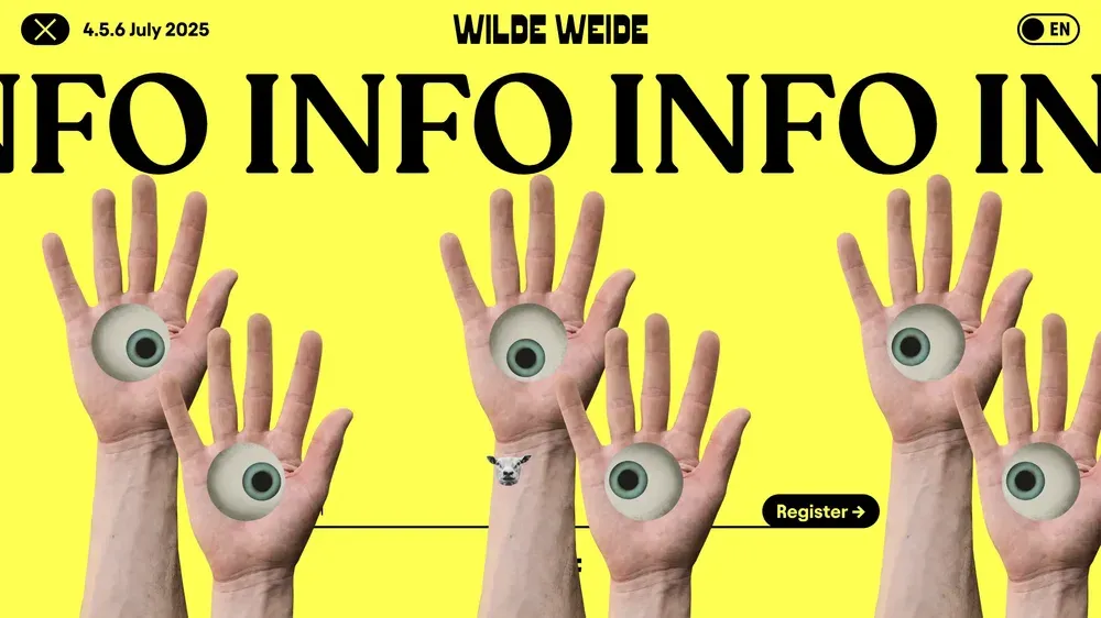
It is not necessary to clearly separate the background and foreground elements from each other. Merging and intertwining, they give your design extraordinary depth. Such layered images, especially when combined with bright colors, make the user experience more interactive and engaging.
Color overlay
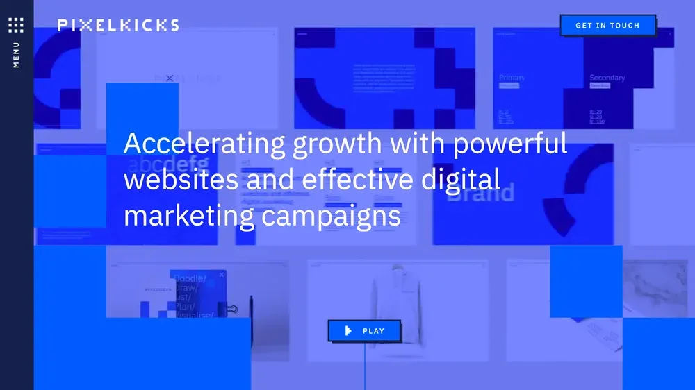
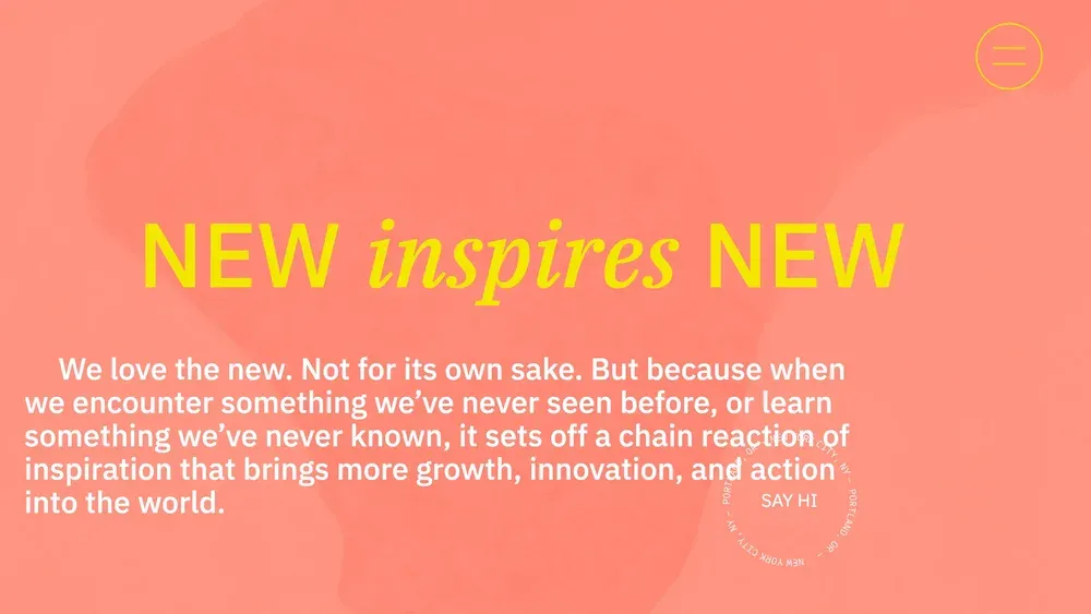
This effect is achieved by layering a colored, almost opaque overlay over an image or video. It creates high contrast, but the underlying layer often becomes almost indistinguishable. This solution is ideal in cases when the background image has no particular artistic value and serves mainly to create additional texture.
Typography as part of the background
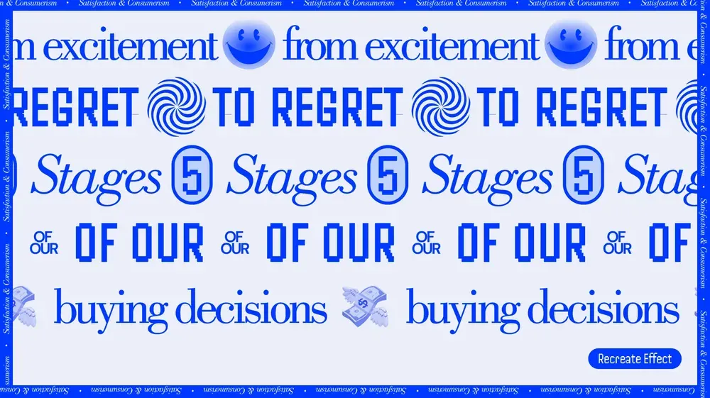
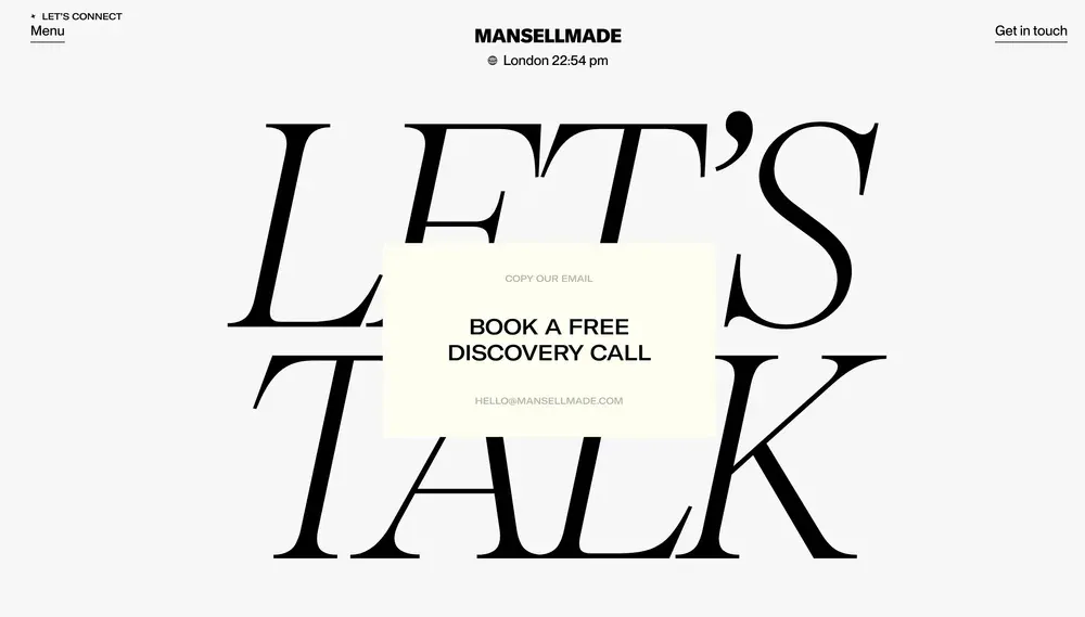
You may not have considered text as part of the background, but it’s an interesting idea. Large lettering can be a great background for other UI elements or as part of a pattern. Creating a harmonious text background is quite a challenge because you need to find the right balance between aesthetics and readability.
Solid color filling
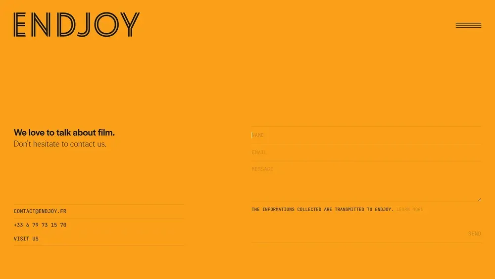
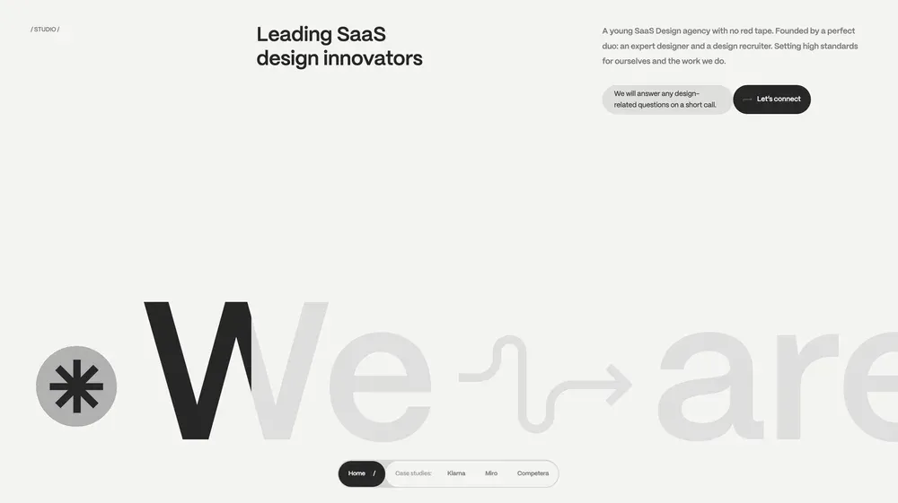
Monochromatic backgrounds will never go out of style. No gradients, no color combinations, just a solid fill. It’s simple, but effective!
Fleas and bubbles
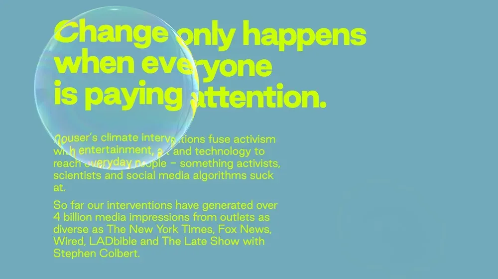
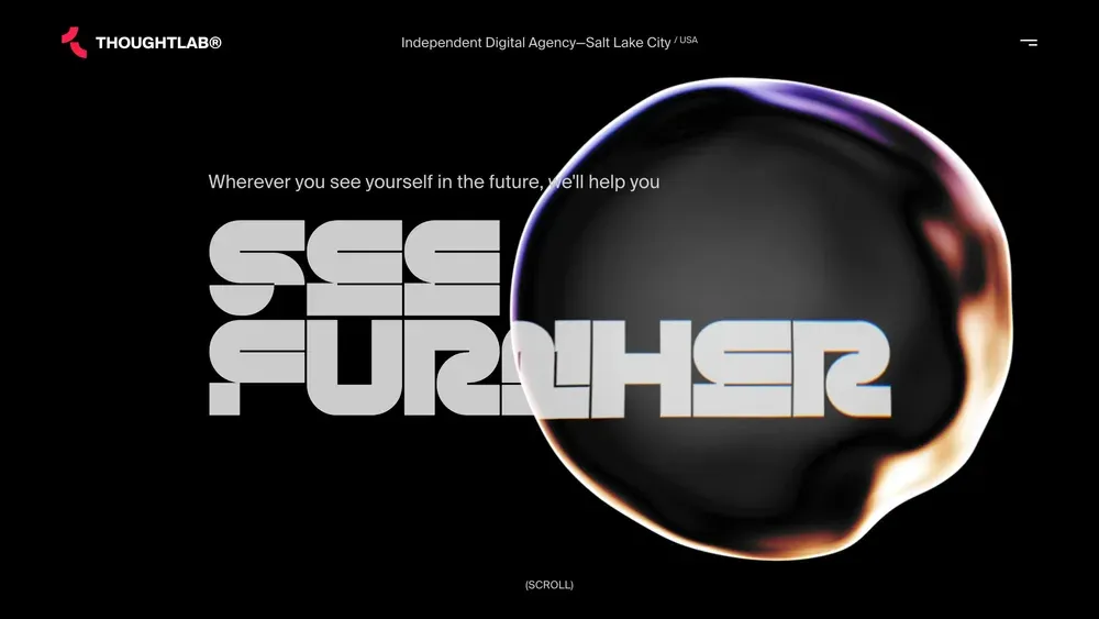
Blobs and bubbles are organic shapes that can be considered “background” even if they are in the foreground, because they have a predominantly decorative function. These shapes “float” on the interface, creating a layered effect and attracting the attention of users. They add dynamism and originality to the design, making interaction more interesting and attractive.
