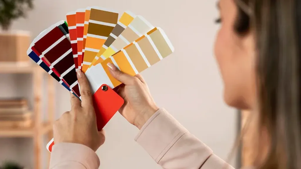
A selection of stylish color combinations for brands and design
Blue and pastel pink

The combination of blue and pastel pink creates a perfect balance. The delicate springtime vibe of pastel pink paired with the elegance of blue creates a sense of harmony and tranquility. This contrasting pair evokes a sophisticated, feminine atmosphere - super for beauty, health and wellness brands.
Color codes: #2F3C7E, #FBEAEB
Dark charcoal and bright yellow

Dark charcoal and bright yellow is a bombastic contrast that catches the eye. Together, these colors look dynamic and modern - the perfect mix for creative agencies, sportswear and urban brands.
Color codes: #101820, #FEE715
Light red and yellow

The bold and energizing combination of light red and yellow is pure joy. Give this ketchup and mustard classic a new twist: replace the deep red with coral for a fresh take on children’s brands or packaging for food and drinks for young people.
Color codes: #F96167, #F9E795
Cherry red and milky white

Cherry red paired with milky white is a true classic that always works. This pair balances between elegance and hospitality, luxury and warmth. It is ideal for premium fashion brands, gourmet restaurants or wedding themes.
Color codes: #990011, #FCF6F5
Blue and white

Another timeless combination is pale blue and white. This combo breathes lightness and trust, like a clear sky on a sunny morning. An ideal choice for brands in the field of medicine, childcare or charitable organizations.
Color codes: #8AAAE5, #FFFFFF
Dark blue and light blue

Don’t underestimate the power of monochrome combinations. The combo of navy and light blue looks authoritative and stylish. This combination is monolithic, professional and trustworthy - ideal for insurance companies or financial services.
Color codes: #00246B, #CADCFC
Sky blue and pink “bubblegum”

Sky blue paired with pink bubblegum is pure fun and positive. This bright pairing screams carefree childhood, so it’s perfect for brands that focus on parenting, children’s clothing, toys, or products for kids.
Color codes: #89ABE3, #EA738D
Cherry red and pink “bubblegum”

This combo of cherry red and pink “bubblegum” is just art house for the eyes. Bright, a little dramatic, but very beautiful combination for bold beauty brands, lifestyle products and everything that needs to be expressive and with character.
Color codes: #CC313D, #F7C5CC
Forest green and moss green

If you want to convey a natural mood, choose forest and moss green. It’s a monochromatic harmony that smells of forest, freshness and sustainability. It is ideal for eco-brands, outdoor clothing and anyone who is passionate about sustainability.
Color codes: #2C5F2D, #97BC62
Pastel olive and salmon pink

The earthy, bright and harmonious duo of salmon pink and pastel olive evokes warmth and nostalgia, associated with nature, peace, happiness and harmony. This fresh and playful combination is ideal for eco-friendly brands, mindfulness products, children’s products and toys.
Color codes: #A1BE95, #F98866
Deep purple and delicate mauve

A dreamy and somewhat fairy-tale combination of deep purple and delicate mauve creates an atmosphere of ephemerality and at the same time groundedness, radiating graceful calm, light magic and delicate harmony. These shades of purple are perfect for beauty brands, wellness products, as well as spiritual or mindfulness products.
Color codes: #735DA5, #D3C5E5
Salmon pink and delicate peach

A soft and discreetly elegant duo of salmon pink and delicate peach. This combination looks friendly, while exuding lightness and sophistication, making it ideal for children’s products, toys, beauty and wellness brands, as well as for food and beverage packaging.
Color codes: #F98866, #FFF2D7
Sea wave and light blue

The combination of sea wave and light blue creates a refreshing balance and harmony. These cool shades evoke a sense of natural lightness and calmness, reminiscent of the sea, sky and nature. The calming blue and soothing green shades of are ideal for spa, wellness, travel, educational, and water initiatives.
Color codes: #C4DFE6, #66A5AD
Turquoise and light green

Just like the combination of sea wave and light blue, turquoise and light green create a fresh and calm combination, evoking associations with lagoons or natural springs and bodies of water. This harmonious palette is ideal for brands that operate in the health, wellness and outdoor sectors.
Color codes: #20948B, #6AB187
Dark green and light gray

Color trends come and go, but this classic and sophisticated palette is sure to stand the test of time. Dark green and light gray create a combination that feels extremely calm and timeless. The earthy and organic shades of green combined with the restraint and neutrality of gray create a palette ideal for wellness and wellness brands, organic products, and brands that offer high-quality craftsmanship, natural materials, and understated luxury.
Color codes: #31473A, #EDF4F2
Cranberry red and bubble pink

The stylish and playful combination of cranberry red and bubble pink creates a bright, modern palette. The rich and bold red combined with the almost mischievous, optimistic pink is ideal for creative or expressive brands of fashion and cosmetics, sportswear, beverages or sweets packaging.
Color codes: #F52549, #FA6775
Navy, royal blue and burgundy
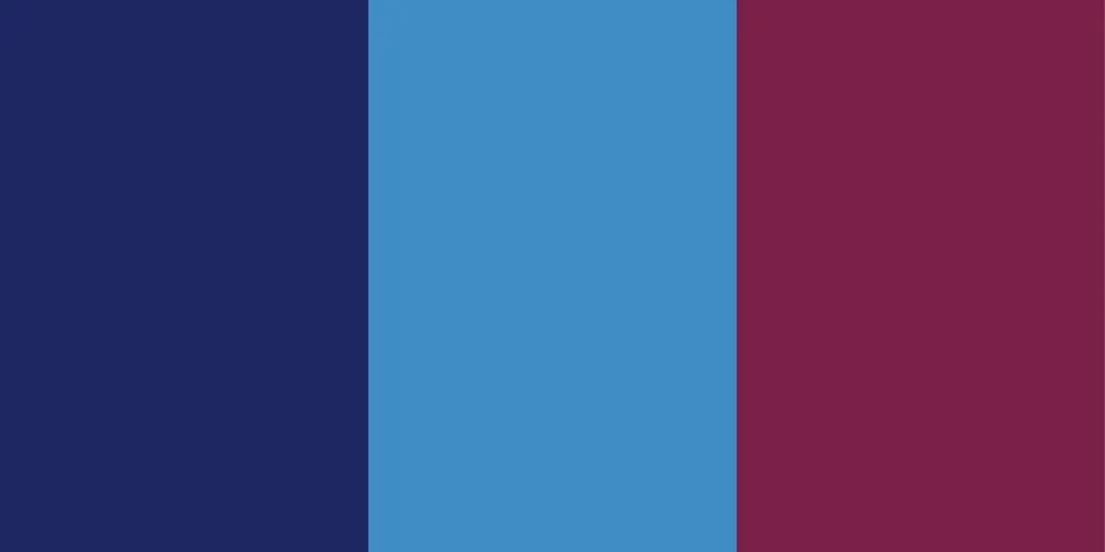
Navy blue, royal blue and burgundy come together to create a visually striking color scheme. The mysterious, bold and luxurious combination evokes a sense of passion and authority - perfect for high fashion and jewelry brands, luxury cars and beverages, high-end restaurants, boutique hotels, perfumes and cosmetics.
Color codes: #1E2761, #408EC6, #7A2048
Terracotta red, light beige and muted turquoise

Terracotta red, light beige and muted turquoise create an enchanting and mysterious color combination. This warm, natural and neutral palette attracts attention with its harmony. Its beauty and timelessness make it a great option for farm products brands, restaurants, interior design studios, outdoor clothing manufacturers and botanical wellness brands.
Color codes: #B85042, #E7E8D1, #A7BEAE
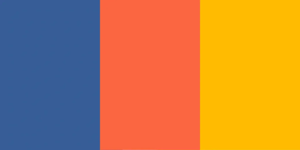
Deep blue, orange-red and yellow-orange
 1
The dynamic and playful palette of deep blue, orange-red and yellow-orange is all about boldness,
energy and vibrancy at its finest. The contrast of cool blues with warm shades of orange creates a sense of movement and
enthusiasm, which is ideal for accent or logo colors. This palette works well for brands
outdoor activities, travel, amusement parks, and food and beverage packaging.
1
The dynamic and playful palette of deep blue, orange-red and yellow-orange is all about boldness,
energy and vibrancy at its finest. The contrast of cool blues with warm shades of orange creates a sense of movement and
enthusiasm, which is ideal for accent or logo colors. This palette works well for brands
outdoor activities, travel, amusement parks, and food and beverage packaging.
Color codes: #375E97, #FB6542, #FFBB00
Purple, ash pink and soft blue-gray

Mauve, ash pink and delicate blue-gray harmonize perfectly together. The combination of soft blue and ash pink creates a sophisticated, feminine palette with a touch of charm and maturity. Ideal for brands in the wedding and event industry, beauty, fashion, home decor and wellness.
Color codes: #962E2A, #E3867D, #CEE6F2
Dark reddish brown, taupe and light peachy brown
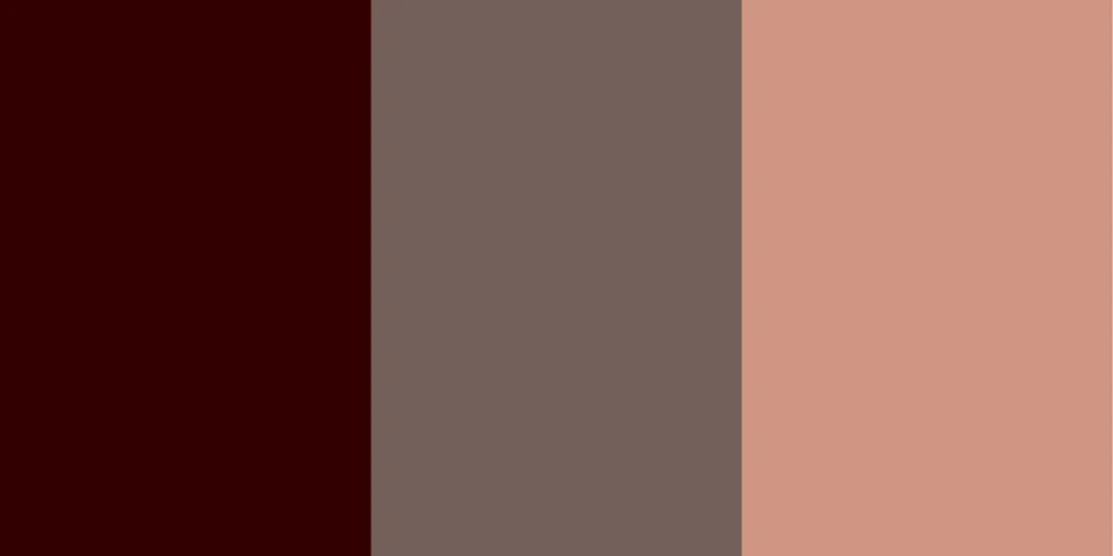
The warm and incredibly cozy combination of dark reddish brown, taupe and light peachy brown creates a natural, welcoming atmosphere for . This timeless and sophisticated palette is ideal for heritage and crafts brands, real estate and interior design agencies, outdoor clothing and equipment brands, craft brands, coffee shops and bakeries.
Color codes: #330000, #73605B, #D09683
Turquoise blue, light blue and light gray

The fresh and modern palette of turquoise blue, light blue and light gray creates a sense of calm, purity and stability, like the clear sky or the waters of a glacier. Ideal for hospitals, clinics, financial services, insurance companies, legal firms, and brands working with cloud security.
Color codes: #1995AD, #A1D6E2, #F1F1F2
Dark chestnut, burnt sienna and soft cream

A warm, natural and very autumnal palette of dark chestnut, burnt sienna and soft cream. It literally smells like autumn evenings and cozy coffee shops. Ideal for organic products, farm brands, outdoor manufacturers, bakeries and coffee shops.
Color codes: #46211A, #A43820, #F1D3B2
Dark charcoal gray, deep rust and sky blue
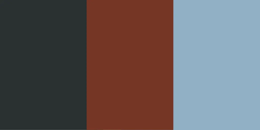
The bold and modern combination of dark charcoal gray, deep rust and sky blue exudes strength, comfort and sophistication. Suitable for luxury brands in the fashion industry, the automotive world, for design agencies or architectural bureaus.
Color codes: #2A3132, #763626, #90AFCм