Interaction of the designer with the developer

Loading data
Vue, React or Angular frameworks are based on the principle of reactivity and dynamism. Or simply put, when you click on any link, the next page is loaded without reloading the site. But if it will be developed using the JQuery library, such an effect is quite difficult to achieve, most likely, developers will not do it.
Therefore, if you know that it will be used for the development of the project, check with the developers how they will be displayed pages — without or with a reboot. Such information will help you take this into account at the stage of creating wireframes.
Libraries
When you determine the technology on which the site will be developed, you need to ask about the UI library that you plan to use in the project. Ready-made solutions for some components, for example, tables or a slider, allow you to save time on creation elements from scratch and prescribing all the logic. If you do not clarify this moment before starting work, then probably a developer will later find a library that ends up being different from the style you suggested. And this will affect the overall appearance of the product.
If developers have already selected a library
In this case, thoroughly research it, read the documentation. Select the components that will be used in yours design and test each element. Namely: adaptation for different screen extensions, explore the logic of work, possible modifications for styles, animation. This will give you an understanding of what can and cannot be changed in the design.

Mostly, the changes you can propose for a component are related to the visual part. It can be fonts, colors, rounding, shadows, etc. Instead, elements related to design logic, such as the principle of opening a drop-down list or choosing a date in the datepicker, it is better to leave it as it is, because it significantly complicates the work of the developer.
If the library is not selected
Then check with the developers if they are going to use the library. In 99% of cases, the answer will be positive. So your hands are free and you can choose the one that you think will best suit the overall look of the project.
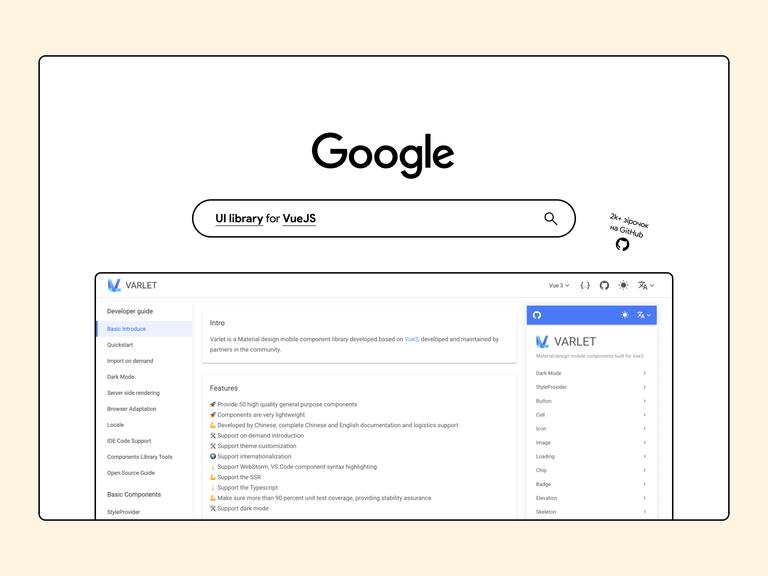
How to choose the right library?
Open Google, write “UI library for the name of the framework” (Vue, React, Angular) or the name of the library (JQuery), at the end you can also add “free”.
We find the library, check the number of stars on GitHub, preferably more than 2 thousand, and send it to the developer link for approval.
The required component is missing from the selected library
If you are designing, for example, for statistics, and the library does not have this component - no problem. For more complex ones elements are often written by separate libraries. The search principle is the same: the name of your framework (Vue/Angular/React) or name of the library (JQuery) “library for + name of the required component” (Statistic/Graph). If you don’t find any library, then you can replace the name of the framework with JavaScript, there this good is enough.

But remember, a large number of connected libraries slows down the site, so try not to use a lot additions I also do not recommend using one library, for example, for buttons, and another — for a table. Better find the one which has all the components you need.
Icons
Think what could be easier than choosing a library of icons? But not all developers like to work with svg, after all there is a much better way to set styles and change them easily. Namely, to use libraries with icons built in symbols The best example is Google Icons:
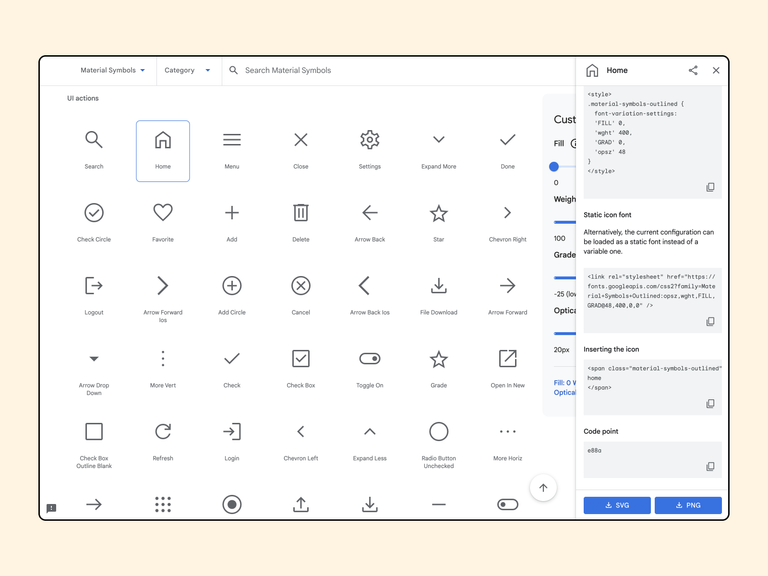
Instead of uploading your svg icons and inserting hundreds of lines of code or god forbid just linking to an image, the developer connects the ready-made library and copies only one line of code. Here he or she can easily add effects, change thickness and other styles with less code.
We are discussing the mobile version
If the design process also includes adaptation for mobile devices, feel free to take the initiative into your own hands and suggest the best approach in your opinion. To choose the right adaptation method, you need to know the basics of HTML/CSS and the principle of working with the DOM or just use what I wrote below.
A component on a page can be hidden in two ways: using CSS (display: none;) or JS. If a component, e.g. the stats block is big and overloads the site, it’s better to hide it with a JS feature. That is, we completely remove it from the DOM. If it is plain text or an icon, then you can use CSS, then the element remains in the DOM.
There are three main principles of adaptation:
1. Standard adaptation.
The server sends the same HTML code to all devices — computers, tablets, mobile phones, non-visual browsers, but the site displays differently depending on the screen size.
With this method of adaptation, it is important not to globally change the structure of the components. It is better to adapt them by reducing the size fonts, icons and by moving the components in sequential order to the bottom. This option of adaptation is the best, as well as his recommended by Google.
2. Loading, hiding components.
Here, the principle of operation is similar to the previous one, but with the help of functions, you can hide unnecessary blocks, that is, completely remove them from the DOM and download new ones, without additional load on the server.
To choose the right adaptation option between the two, look at your design and answer these questions:
- If I hide a block, will I have quick access to it on this page when clicking on a button, icon, or text?
- Can I make this element smaller without adding logical elements to it like slider, scroll, etc.?
If the answer to both is positive, then use standard adaptation, if not - discuss this approach with the developer and prompt it to download new components.
3. Downloading new components or creating a separate subdomain for the mobile version of the site.
If you understand that the adaptation of the current content for a mobile device will deteriorate the visual appearance of the product and no options to use approach #2, ask the developers if it is possible to completely replace the components or create a separate one site under a new subdomain.
Browser support
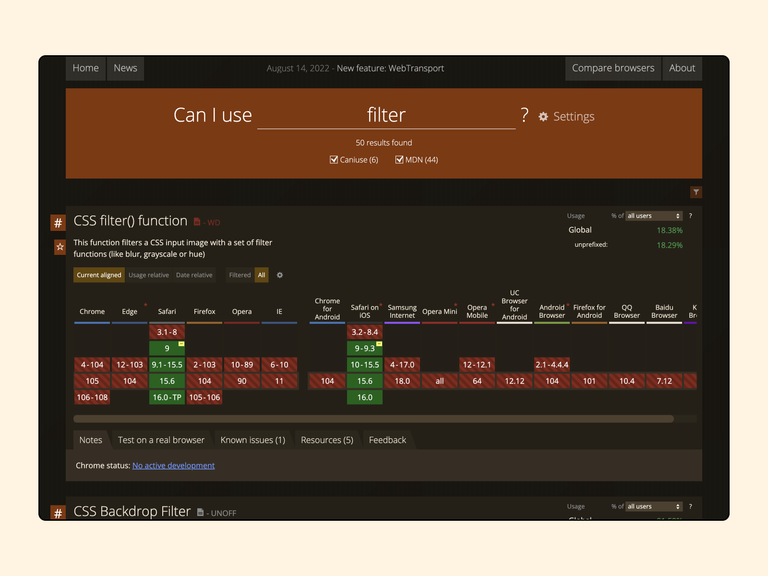
Let’s imagine the situation - you are working on a design for a banking application and then it occurs to you to design a credit blur cards. It turned out incredible, Tim Lidych praises you and you, with your head held high, copy this design into the client’s file
The next day, a message comes from the developer that it needs to be reworked. You are angry, calling this developer you delete your masterpiece with bad words and tears in your eyes. Why did this happen? If we talk about blur, then for him in CSS has a corresponding filter: blur() style, but the problem is that not all browsers support this effect. Because of this to the developer you need to implement your idea in roundabout ways. And this significantly increases the development time due to, at first glance, such a small thing.
We are investigating the elements on the site
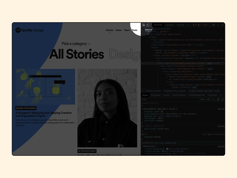
An important point in working with design, which should be adopted by developers, is working with developer tools, which built into every browser. Why do we need it?
Sometimes there are situations when you need to know colors, fonts, sizes of components on a site or platform without access to the working file with the design. Then we can use the developer panel. It can be called by pressing F12 or with the right mouse button and selecting the “Inspect/Explore Item” item.
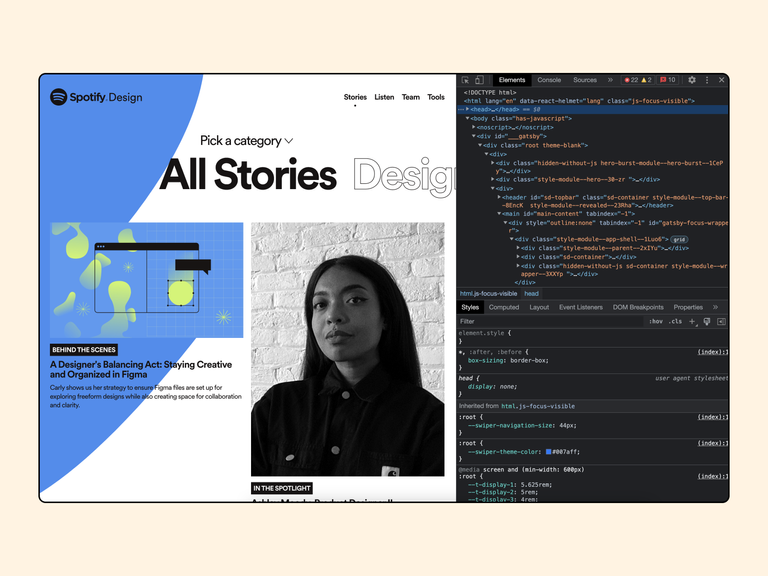
In the developer panel, you need to find the Explore element button. It is located in the upper right corner of the panel.
After we clicked on this button, we need to hover the mouse over the required element to find out all its properties:
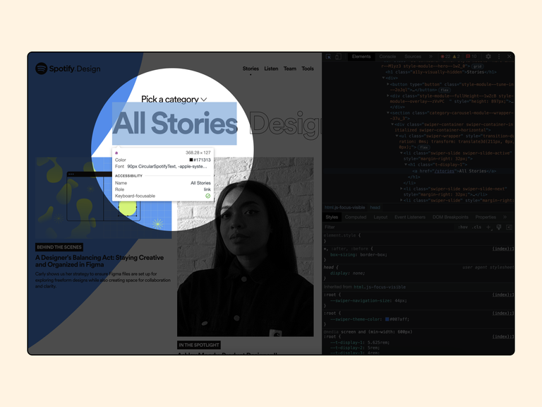
Here we can find out the dimensions of the element, color, font size and its name. If these data are not enough for you, then yes using the same button Explore the element by clicking on the required element. After that, in the developer panel, in the section Styles will open all the styles of this element:
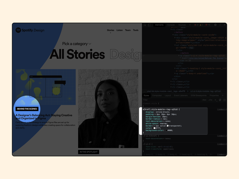
Here we can find styles for:
- Internal and external indents, which are set using the padding and margin properties;
- The color of the text specified using the color property;
- Rounding of the element specified using the border-radius property;
- Color for the background of the element specified using the background-color property;
Also, with the help of the developer panel, you can quickly check your design decisions by changing the styles of the elements. According to the example shown in the previous image, we can change the styles for any element in the Styles section, or add yours. All CSS properties can be viewed on this site.
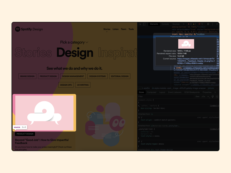
And the most important thing you can use the developer panel for is to access and download, it would seem, no images or icons are available on the site.
After opening the developer panel and clicking on the Explore button, point to the required image and click on it.
The HTML code where this image is located will be automatically highlighted in the Elements section. Mostly links are added to the img tag, but it often happens that the image can be hidden in the picture → source tags. In any case, looking in the HTML code for something If you click on the link, you will definitely come across the image:
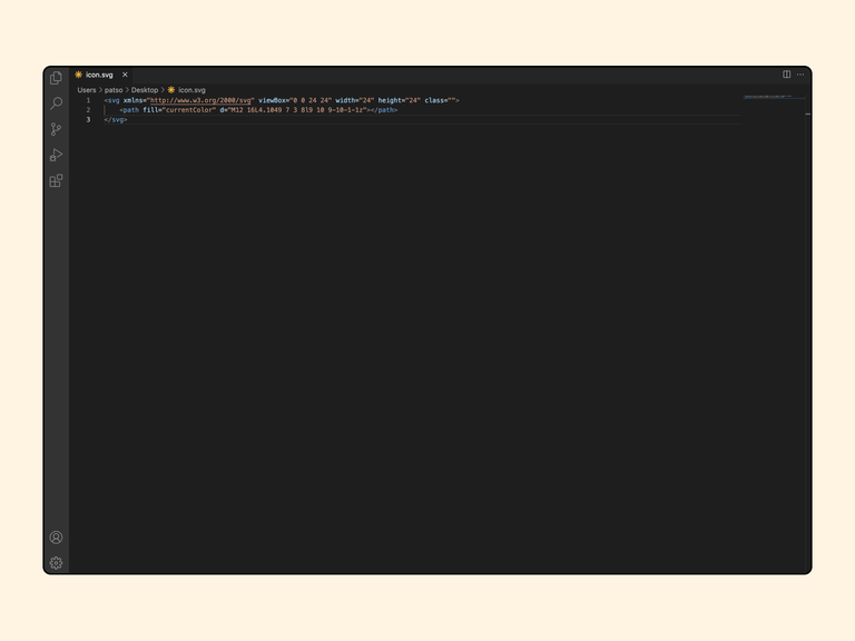
The situation is a little more difficult with svg icons. To load this type of image, you will have to work with code.
We find the necessary icon on the site, click the Explore button, and then select the element. In the case of the svg icon, we won’t find the source link in the site structure, but we can see the icon svg code that we should copy.
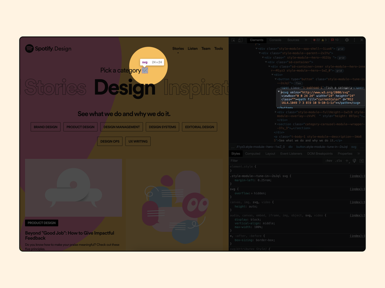
After we copy the code, we need to paste it into any code editor (Visual Code, Notepad ++, Webstorm, Codesanbox) and save this code as an svg file. Voila, your icon is ready.
Auto layout only
The principle of building blocks in Figma is identical to the layout of the site. And the next person who will work with your design is not the user, namely the developer. Imagine him or her looking at your grouped components, scratching the back of their head and thinking, “Where’s the logic in that?”.
The construction of the component must match the code that the specialist will write. Let’s consider an example. In the image that is located below we have a component based on the message type from the user:
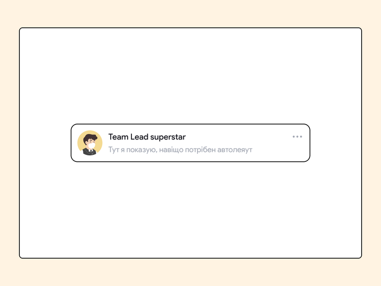
We have his photo and name, message text and three dots for a specific action. To build this block in HTML, we you must first make a parent block that will contain two separate logical blocks that are responsible for different actions:
- First block: User data and messages.
- Second block: Three dots.
What will be in the block with three dots is no longer our business, because we cannot show it in our auto layout. Ago go to the user data and messages block. Here we can also divide the content into two logical blocks:
- First block: Photo of the user.
- Second block: Message data, which will contain the next two logical blocks.
I hope that you understood the essence of the logic. The developer analyzes a specific component according to this principle and should do the same auto layout can also be built. This is important not only to make it convenient to change something in the future, but also to simplify work with to the developer.

Hierarchy in frame names
As you can see in the image above, each block has its own name that describes its essence. It is set first to the parent block, for example, message, and later, in hierarchical order, to all child elements — message__detalis or message__actions. This approach is optional, but it helps developers navigate building the component and it’s easy to come up with class names. After all, it’s better to have a named structure than to name everything Frame 46658.
Instead of a conclusion
When working with frontend developers, it is unlikely that you will be able to completely avoid problems or misunderstandings. But when you know what you do and how exactly it will be implemented later will help you avoid common designer mistakes and make the whole process easier myself and the developers.
Before leaving this page and going to apply new knowledge, do not forget to follow our social networks to receive useful content while you lazily scroll through the feed.